Design Systems | Design at Scale
B2C Enterprise Design System
Design Systems Summary
TL;DR — Design Systems
- Role: Design System Contributor / Senior UX
- Focus: Tokens, accessible components, documentation site, governance & contribution model
- Scope: Web (responsive), native patterns alignment, theming, code parity, release/versioning
- Partners: Product Design, Front-end Eng, Platform/DevOps, Brand, Accessibility, QA
Outcomes
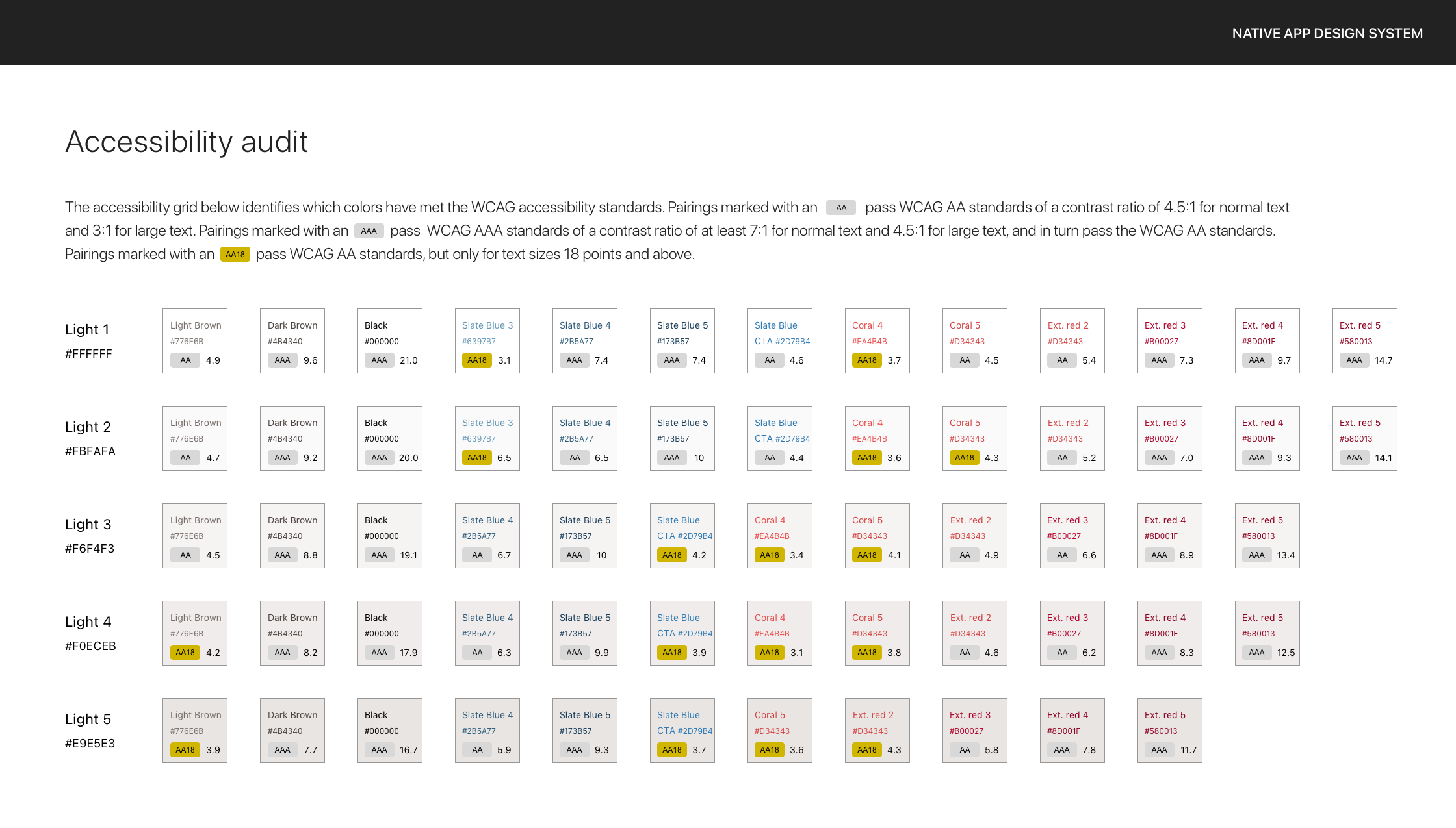
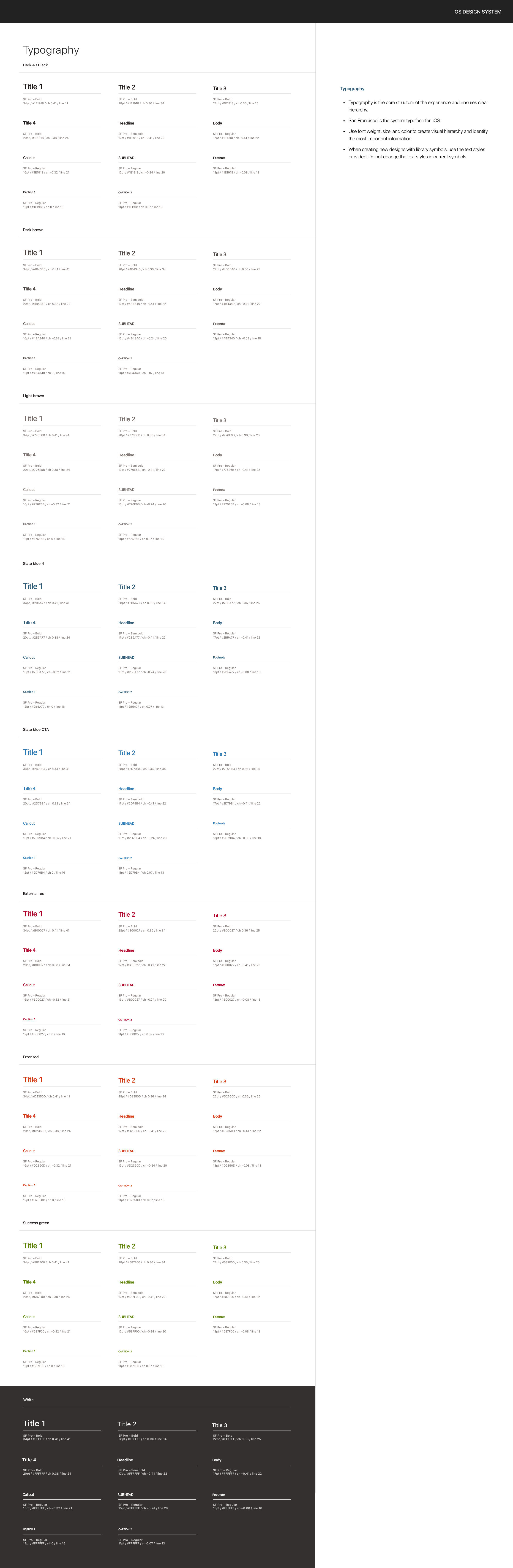
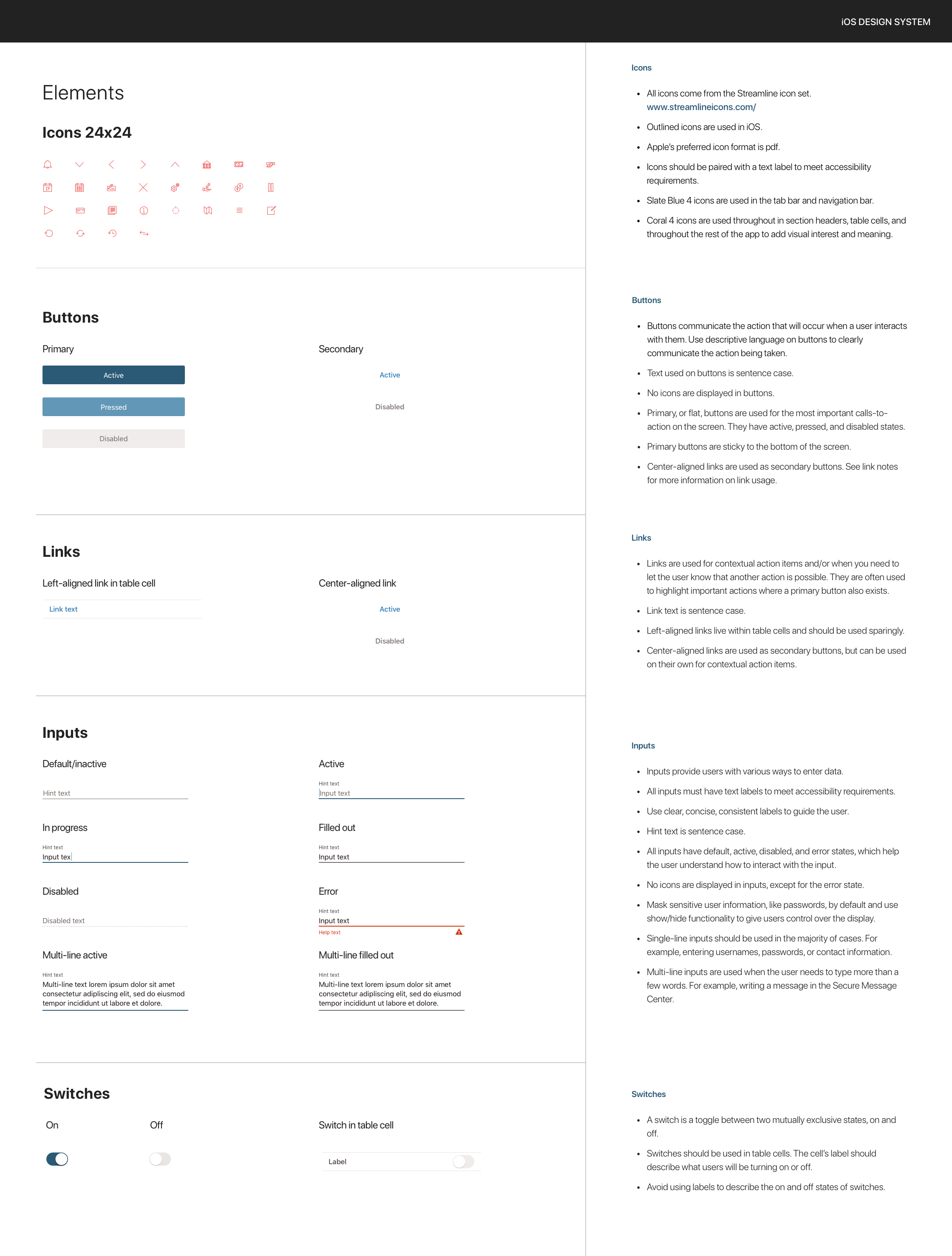
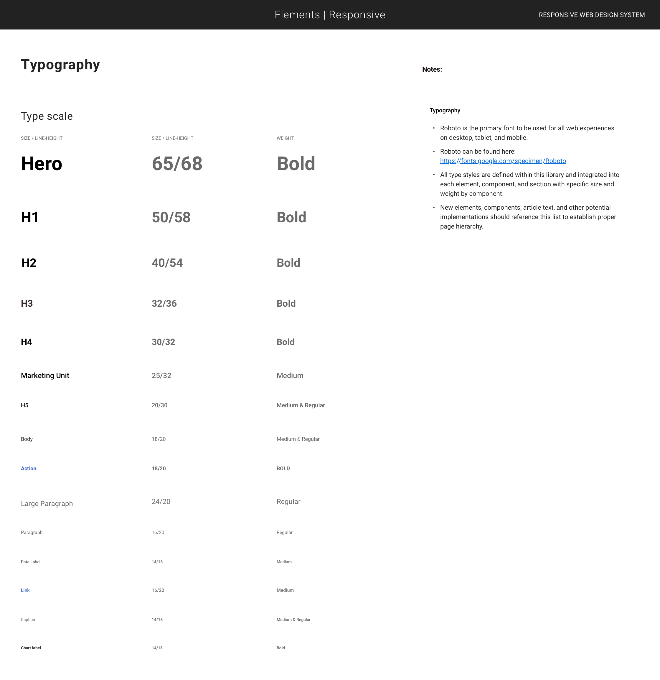
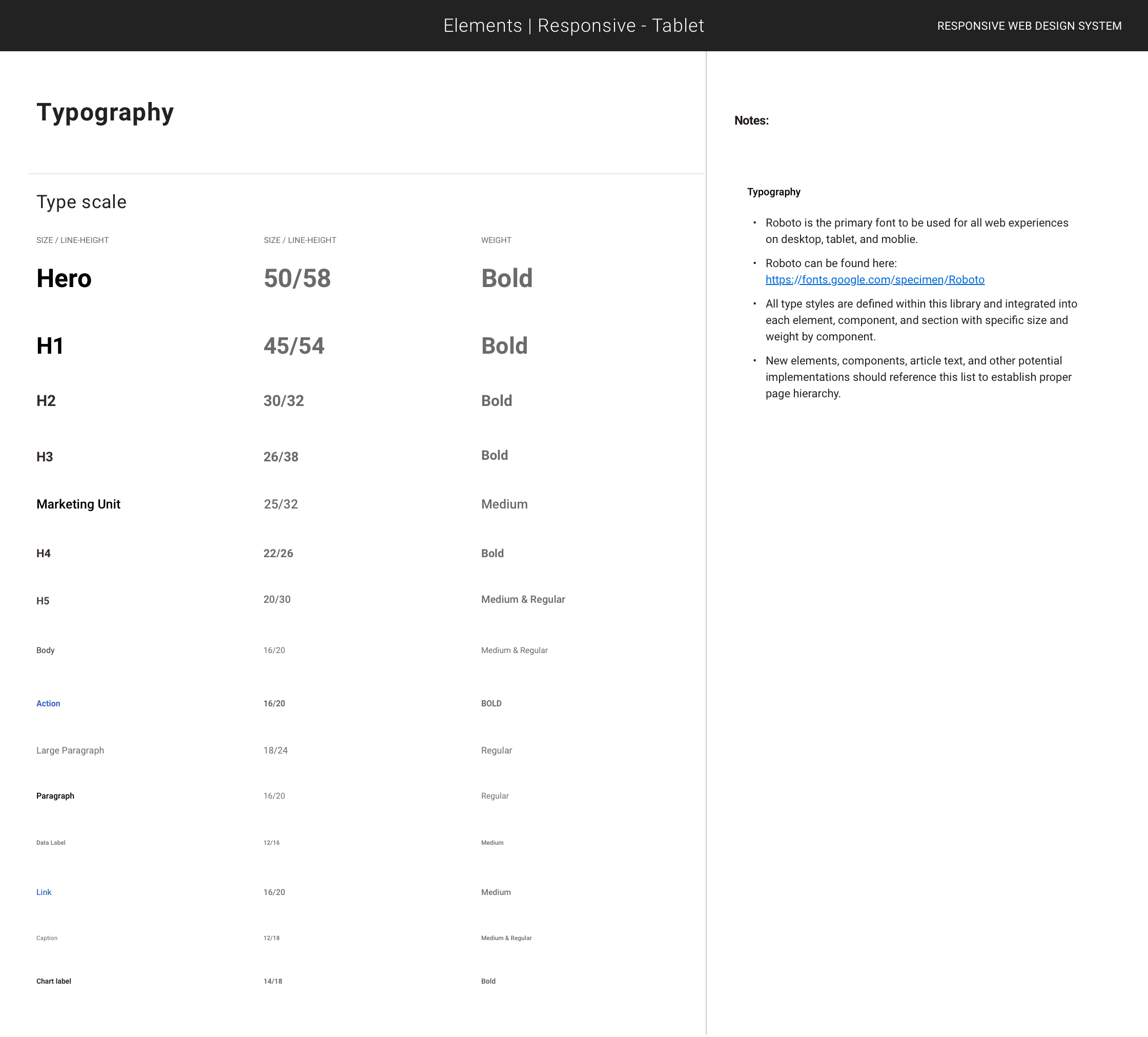
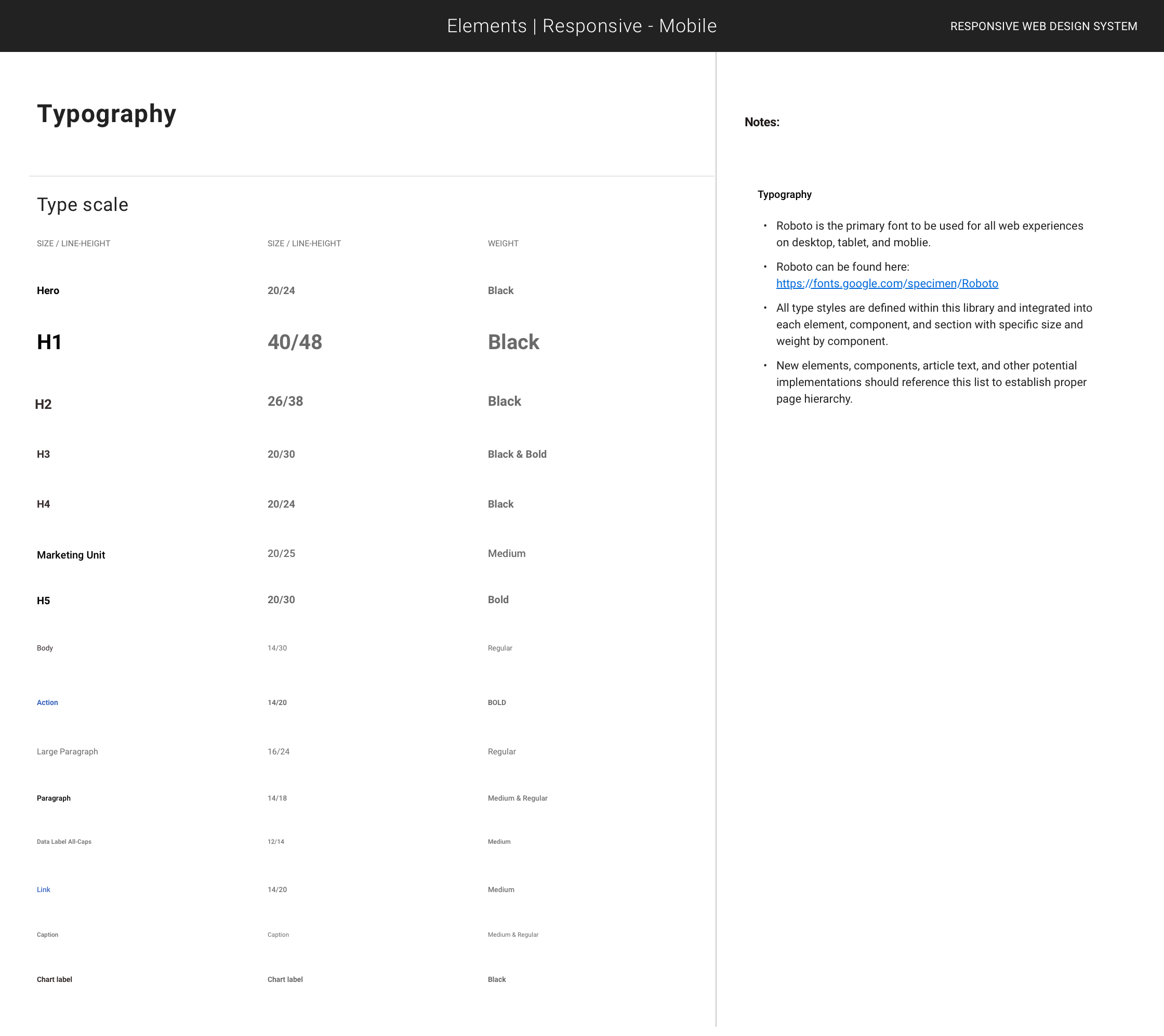
- Single source of truth for design tokens (color, type, spacing, elevation, motion) with versioning
- WCAG 2.0 AA-ready components with keyboard and screen-reader support
- Faster delivery via reusable components, templates, and code-aligned specs
- Reduced visual/interaction inconsistencies through linting and visual regression checks
- Self-serve documentation (usage, do/don’t, API) that enabled org-wide adoption
How we measured
- Adoption: Figma analytics (component insertions/detaches), # of repos importing DS packages, % of UI built from DS primitives.
- Velocity: Time from design handoff to merged PR; PR size/complexity; story points vs. bespoke builds.
- Quality: Axe/Deque violation trends; contrast token audits; UI bug rate and severity on DS vs. non-DS surfaces.
- Consistency: Visual regression pass rate; linting rule adherence; reduction in ad-hoc variants.
- Documentation health: Page views, search queries, and contributor PRs to the docs and component specs.
Reconstructed summary for portfolio; no client data or internal screenshots shown.
I’m a designer and a systems thinker—design systems aren’t a deliverable to me, they’re how I build. Over the last decade I’ve led systems work across financial services and DTC, taking teams from scrappy component libraries to governed Figma systems with tokens, states, accessibility, and code alignment. I care about the unglamorous parts—naming, variants, motion, content rules, handoff—because they cut rework, speed delivery, and lift conversion. The system below is B2C: patterns that scale, stay compliant, and move the numbers.
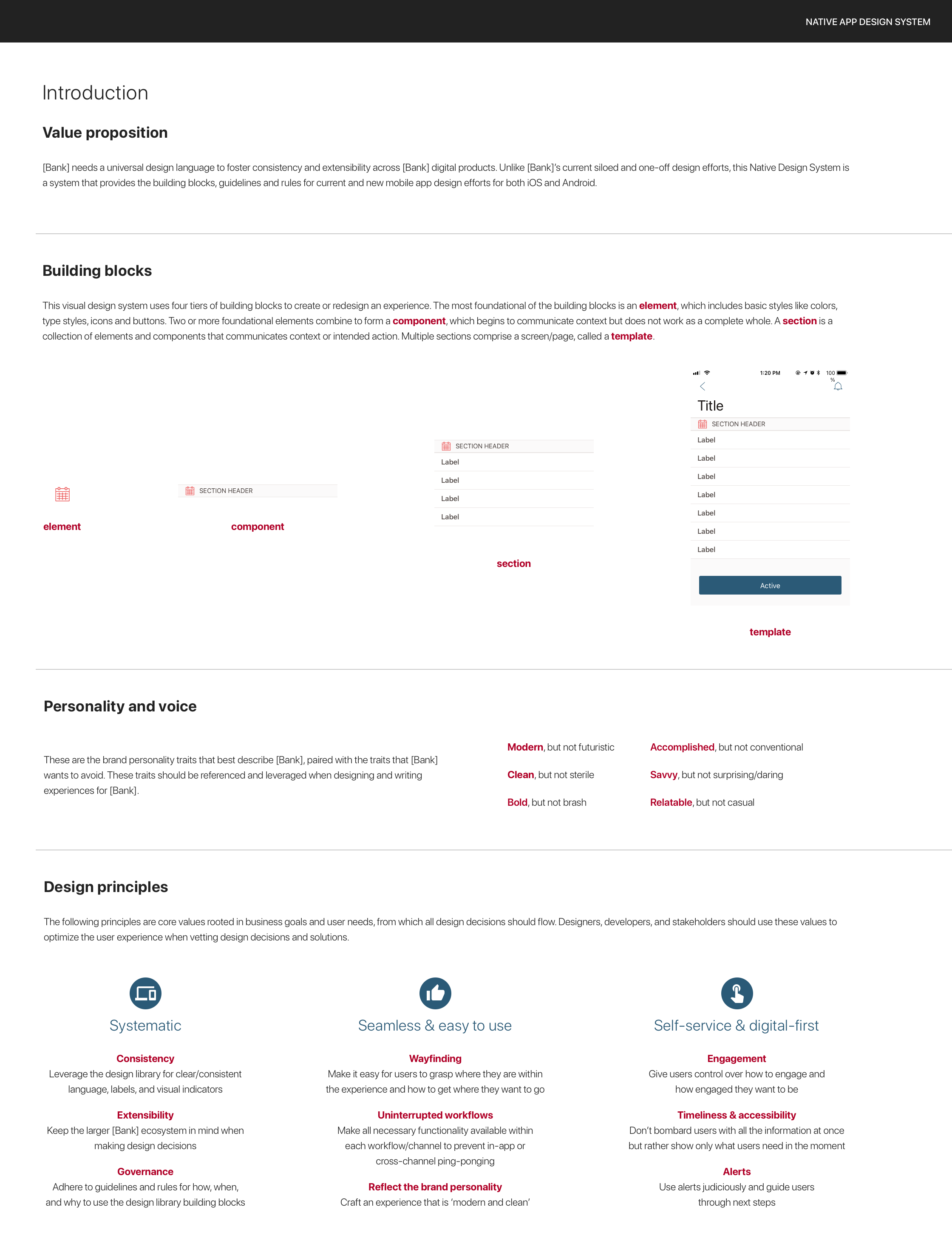
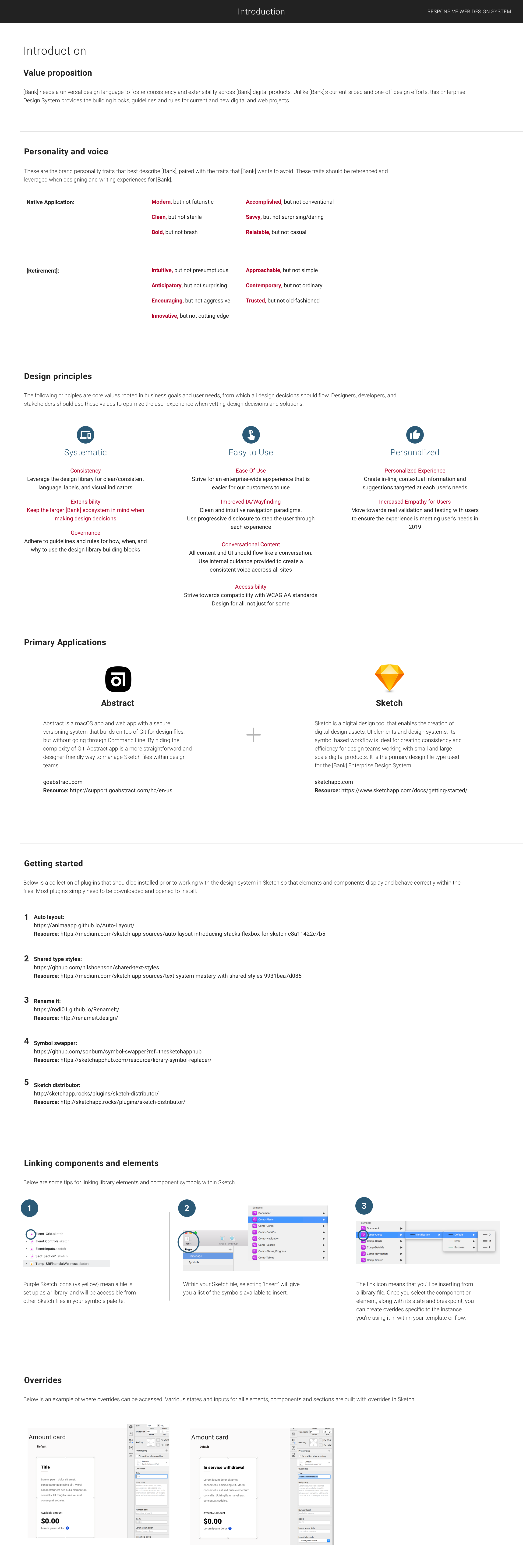
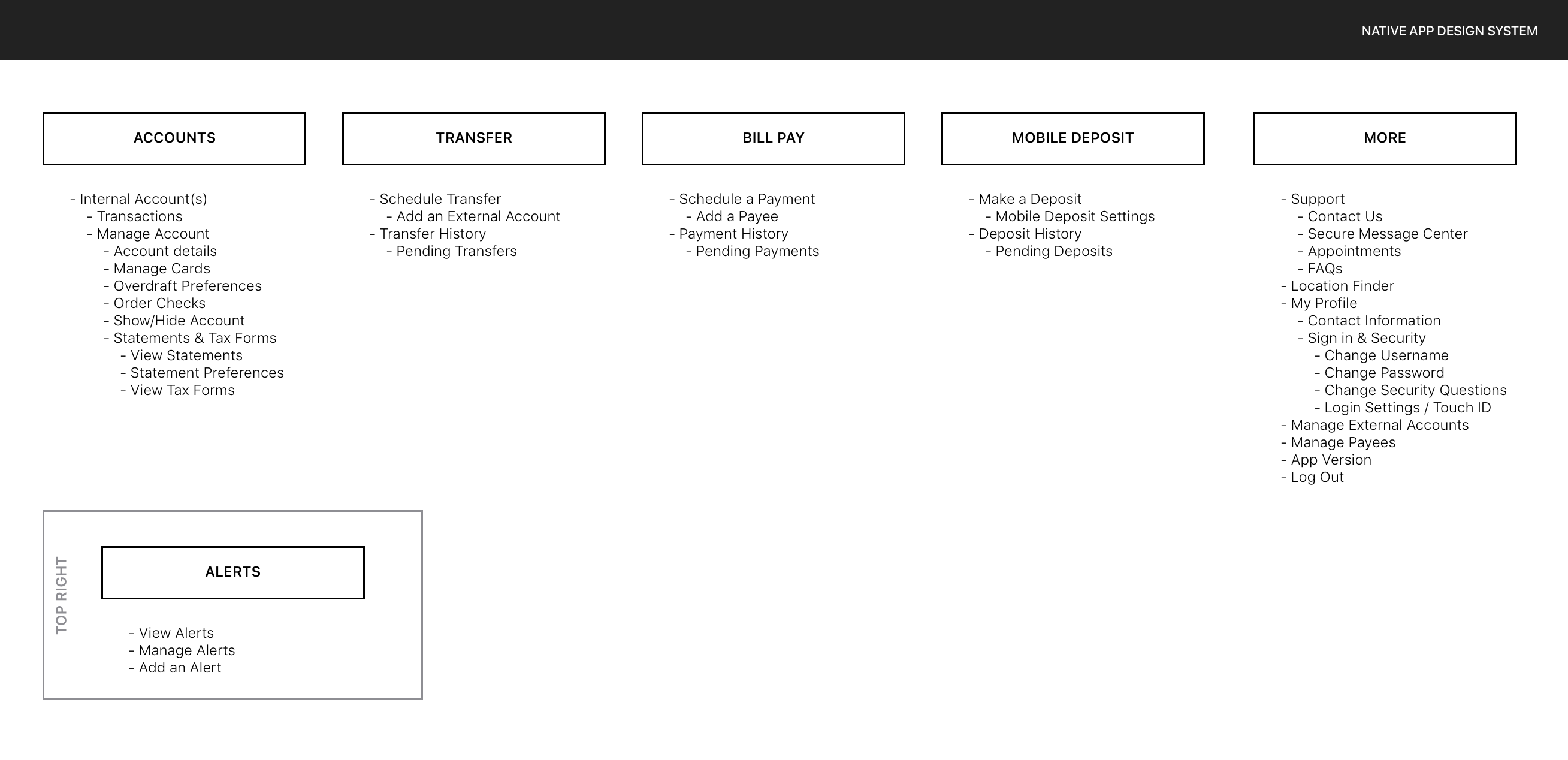
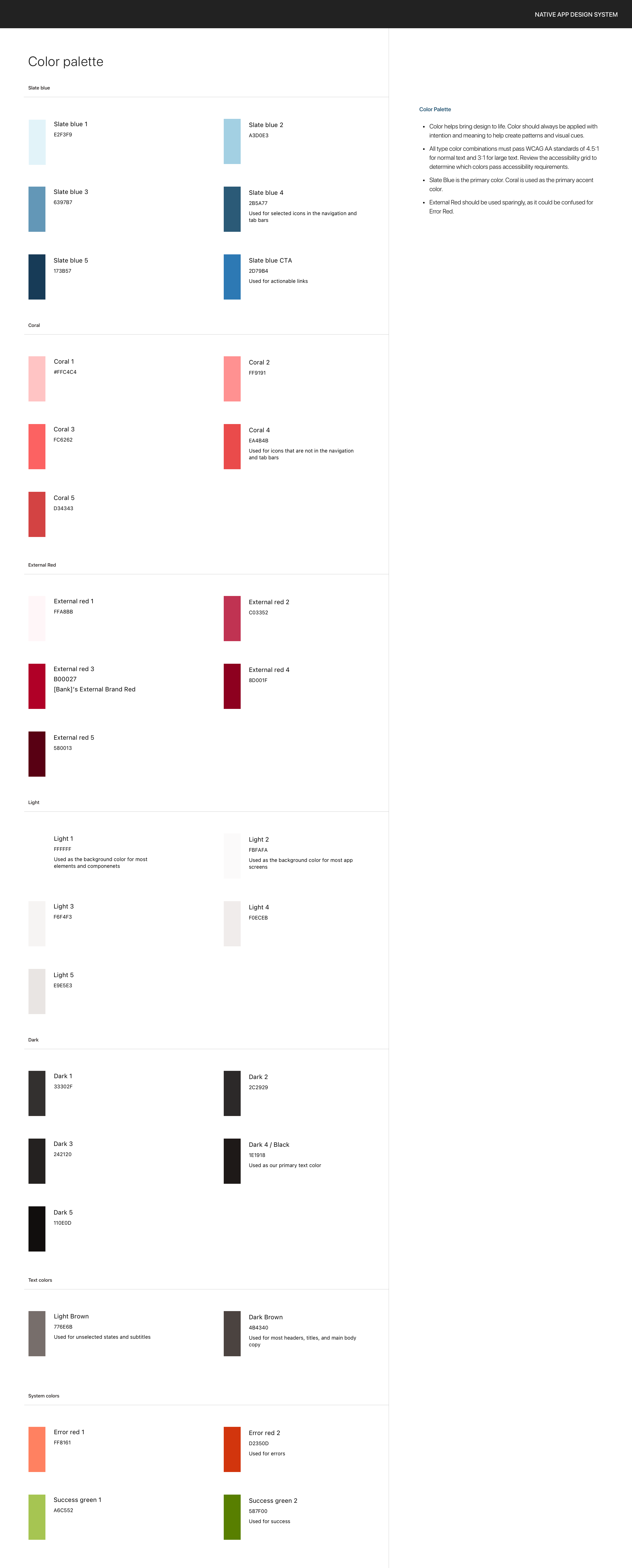
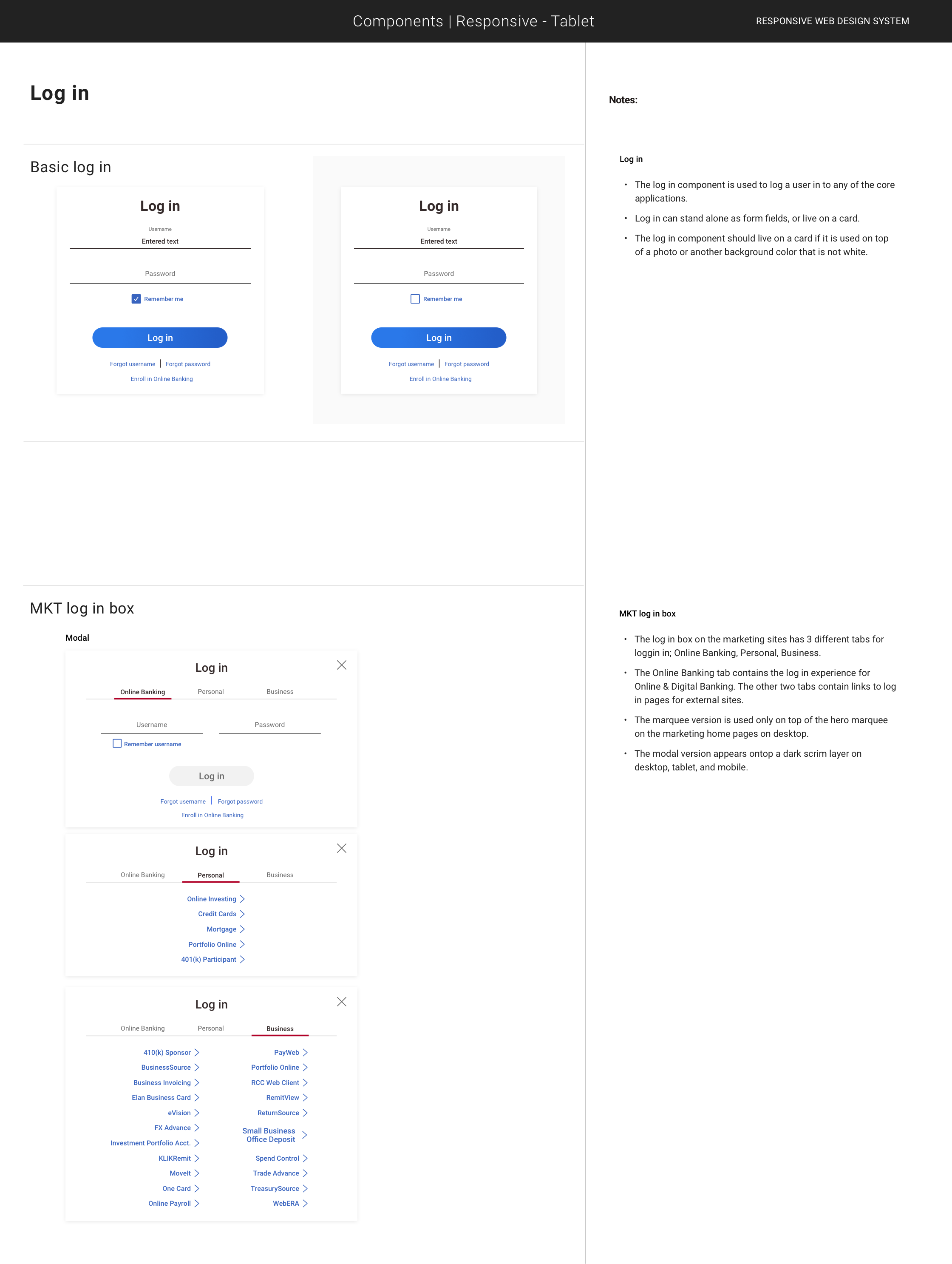
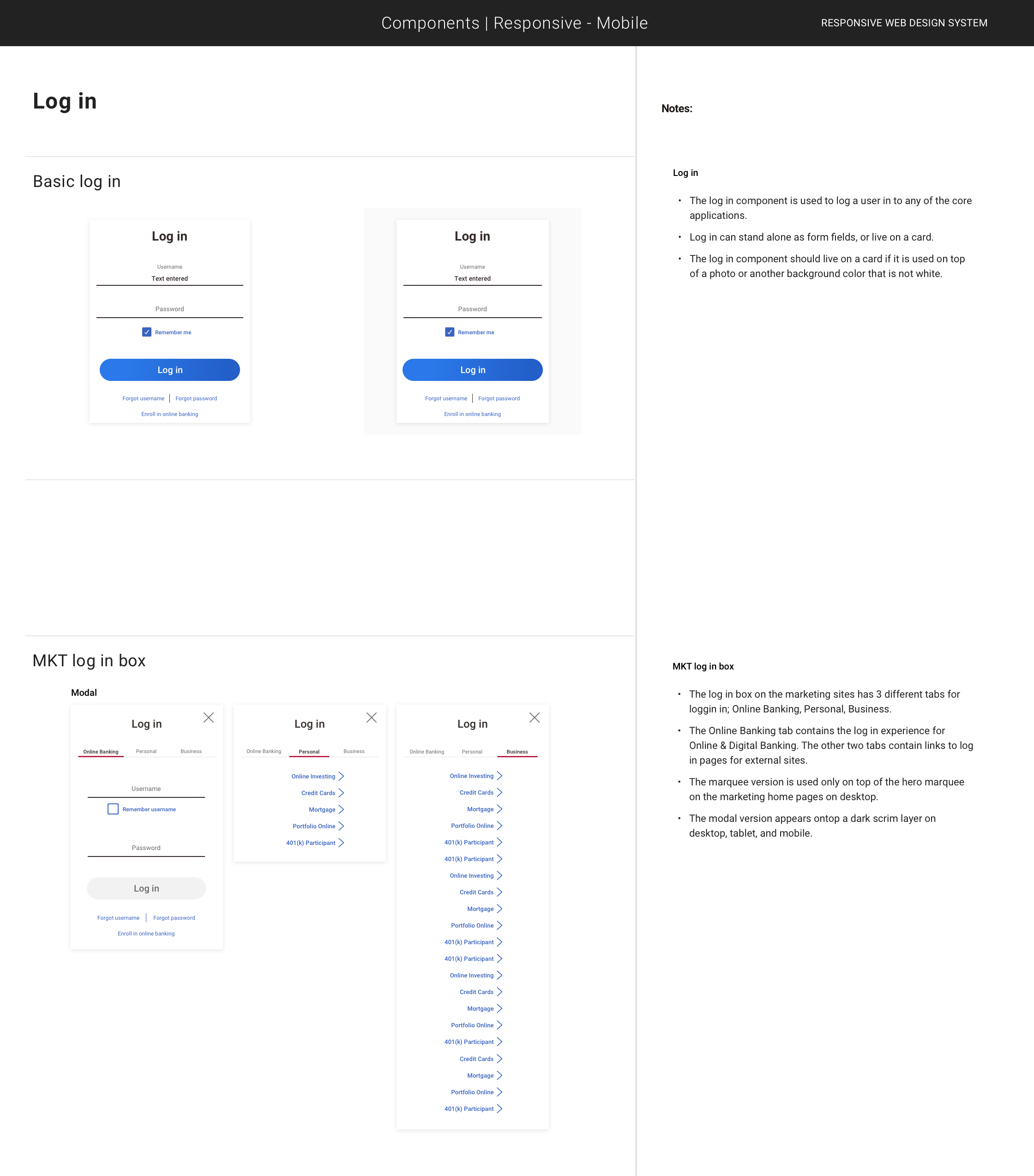
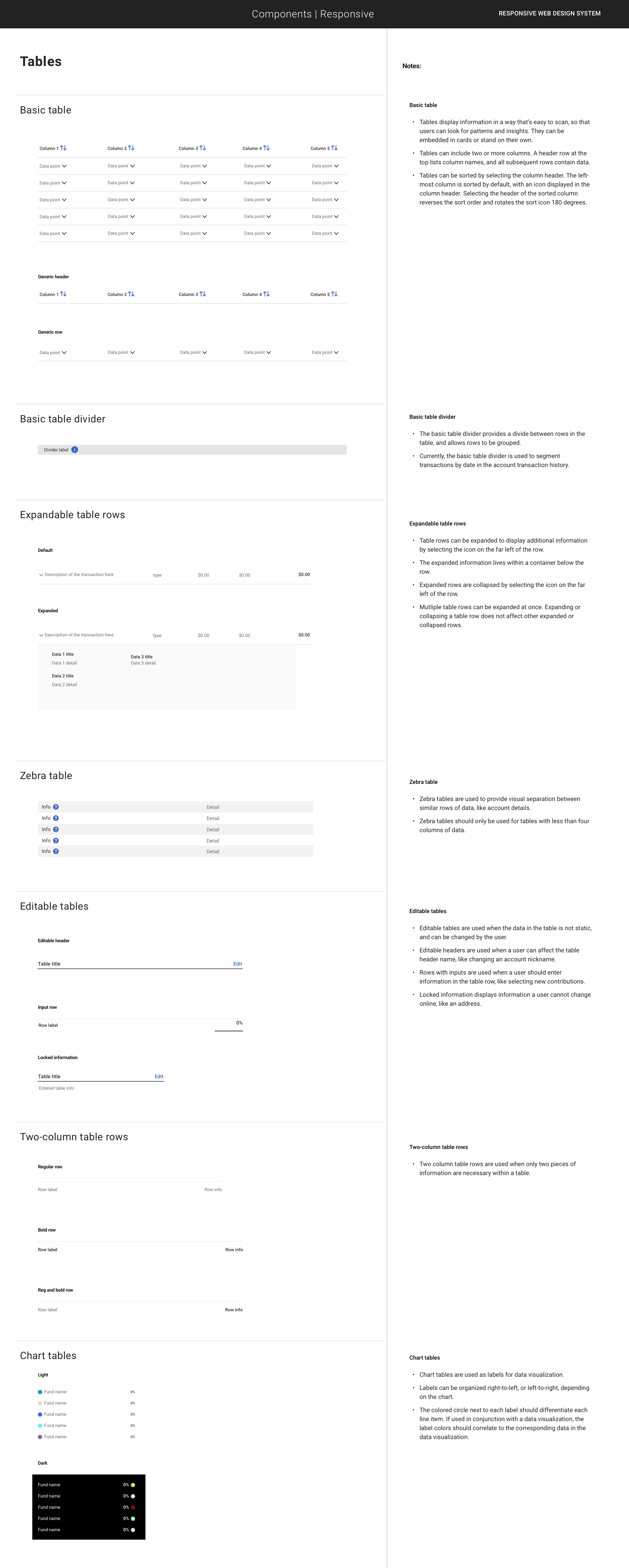
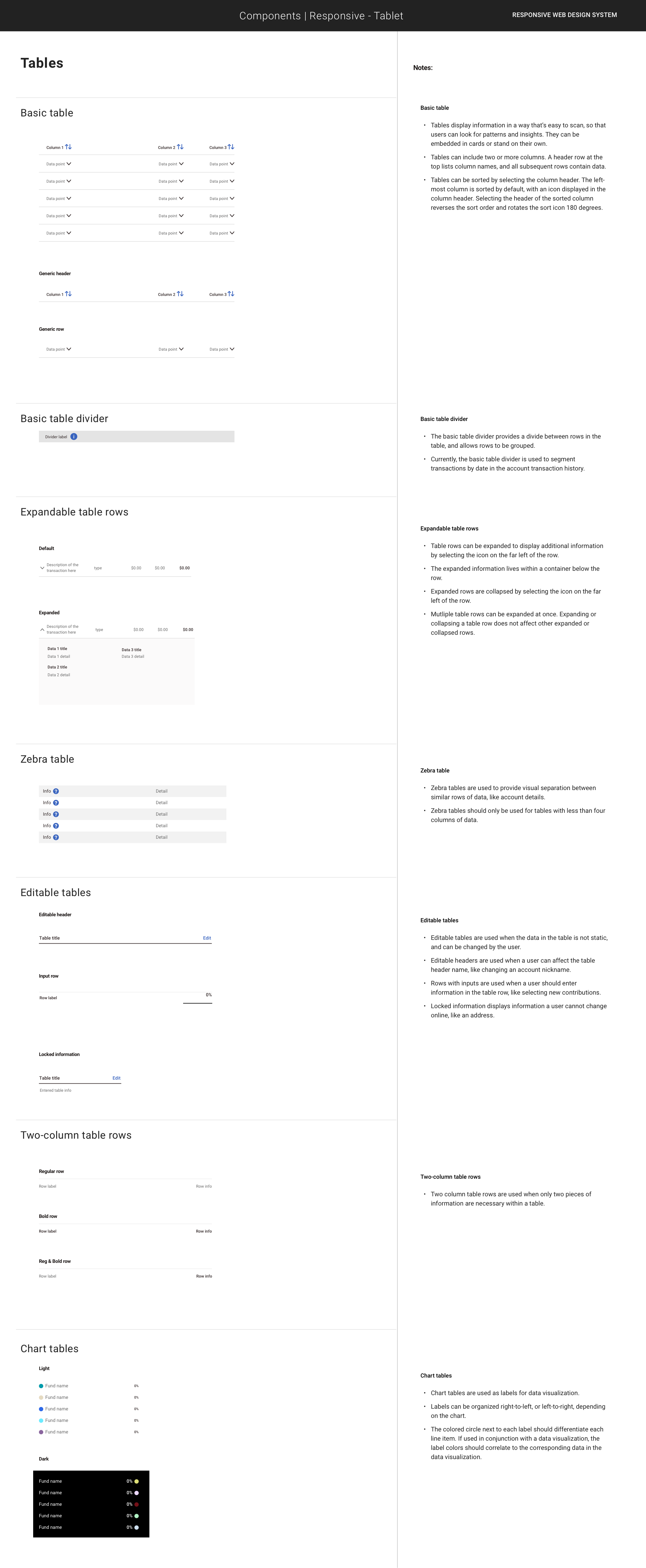
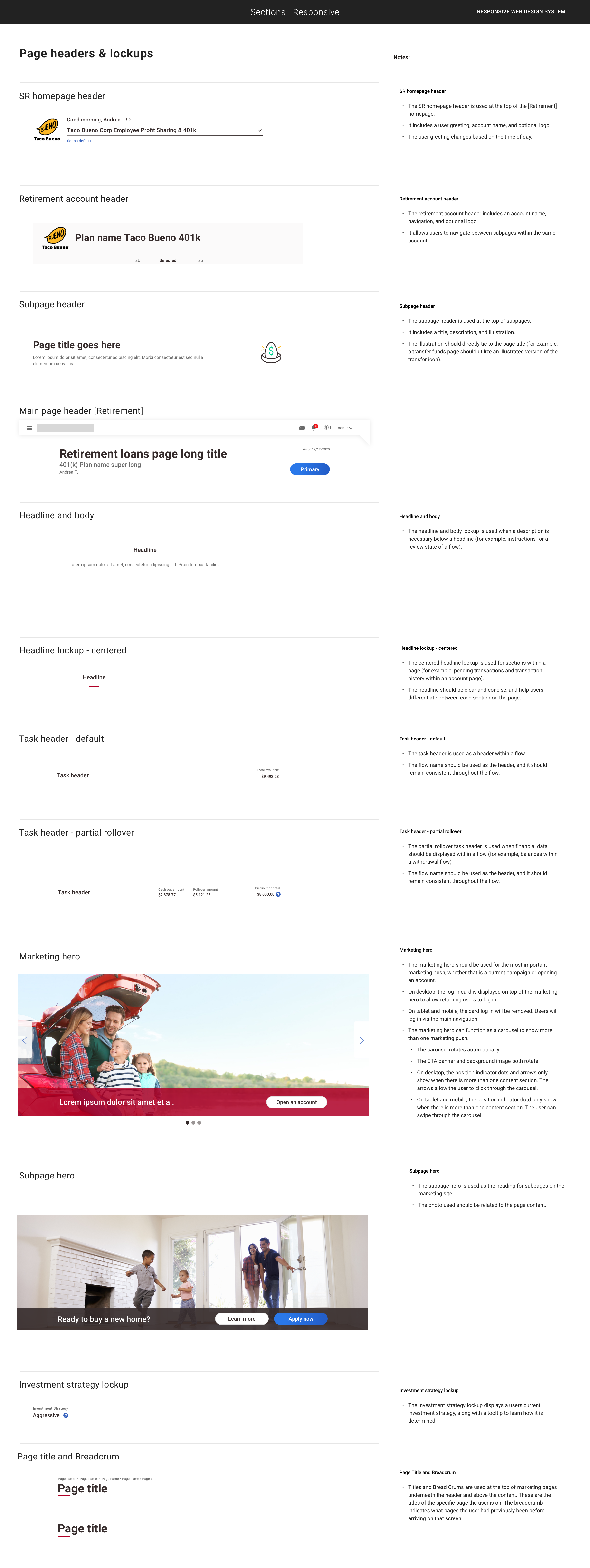
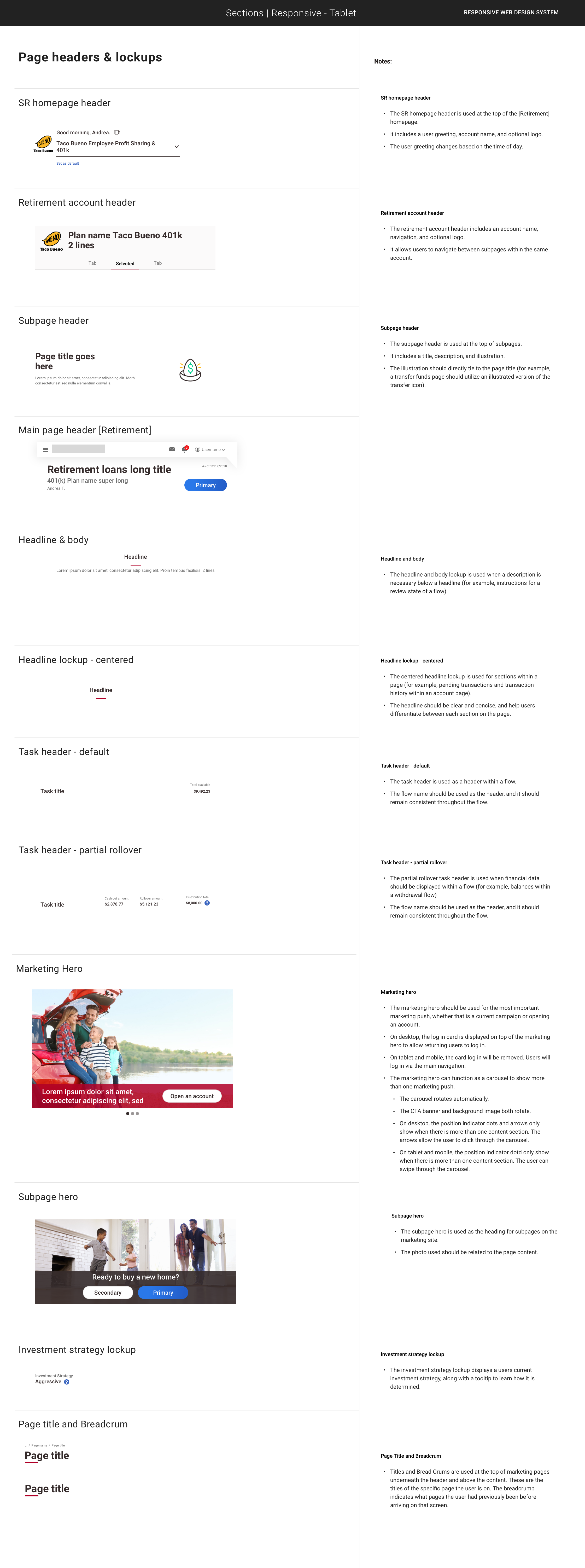
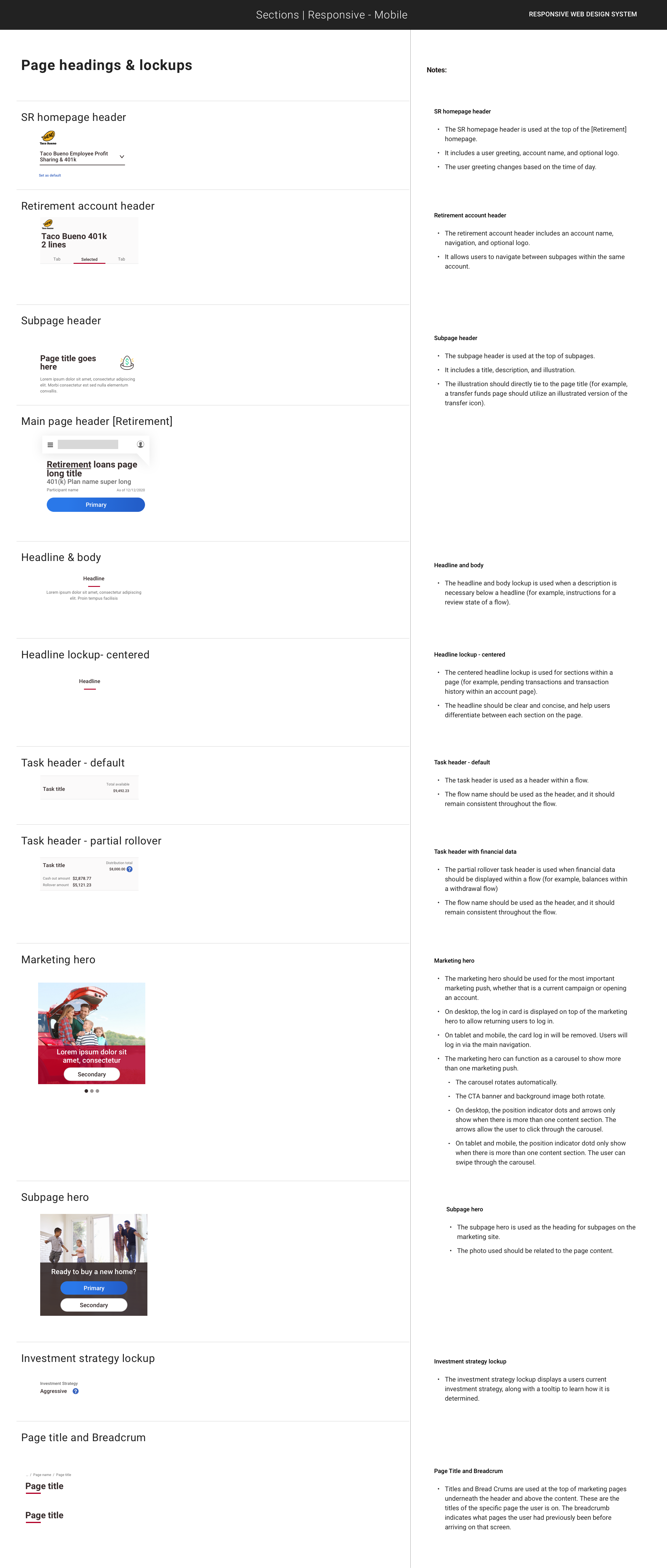
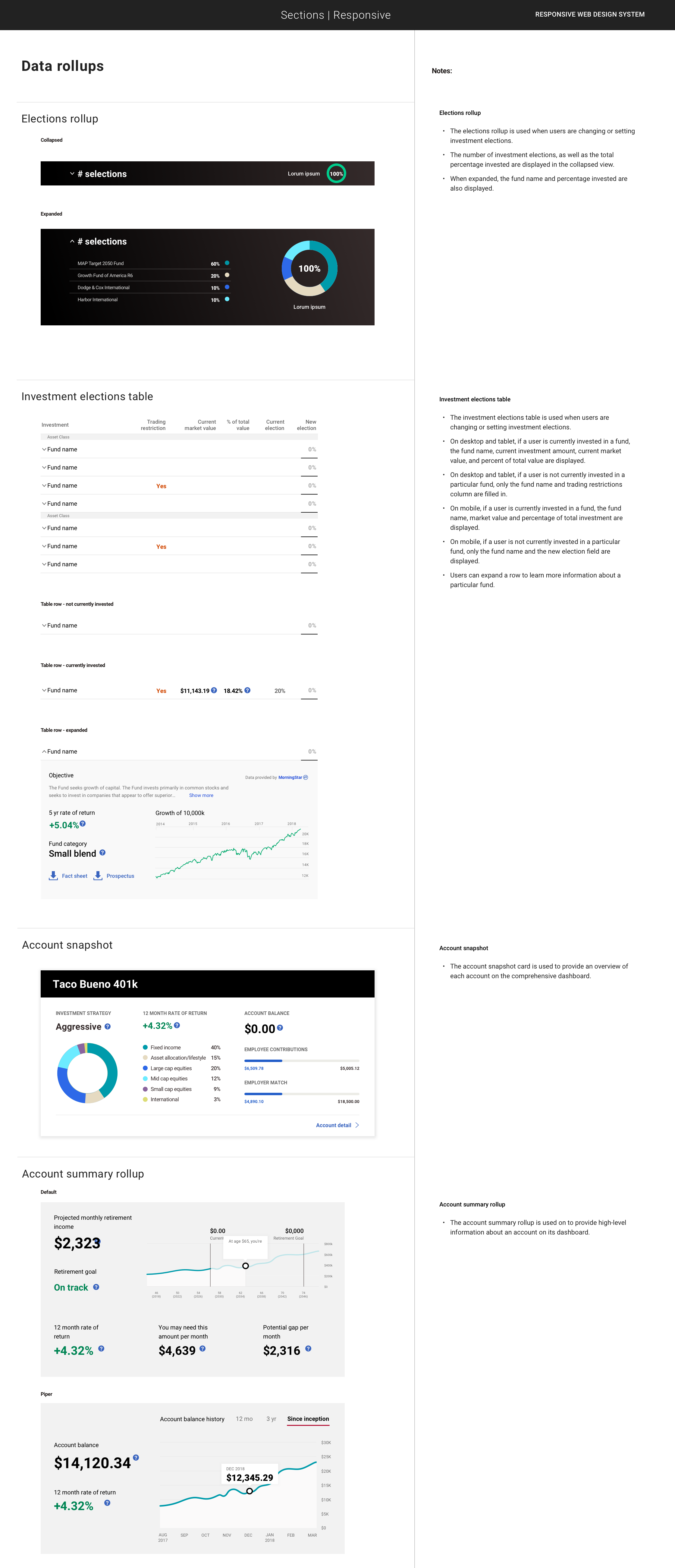
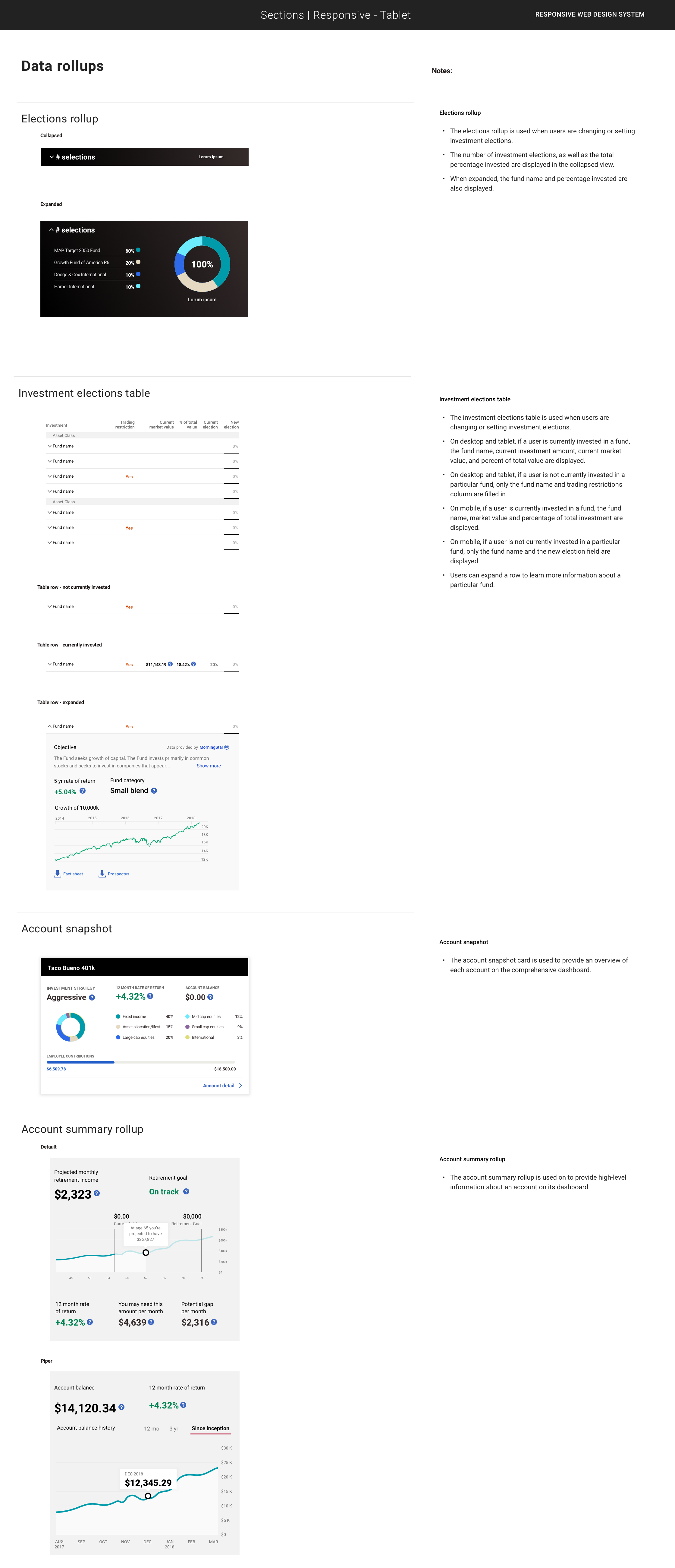
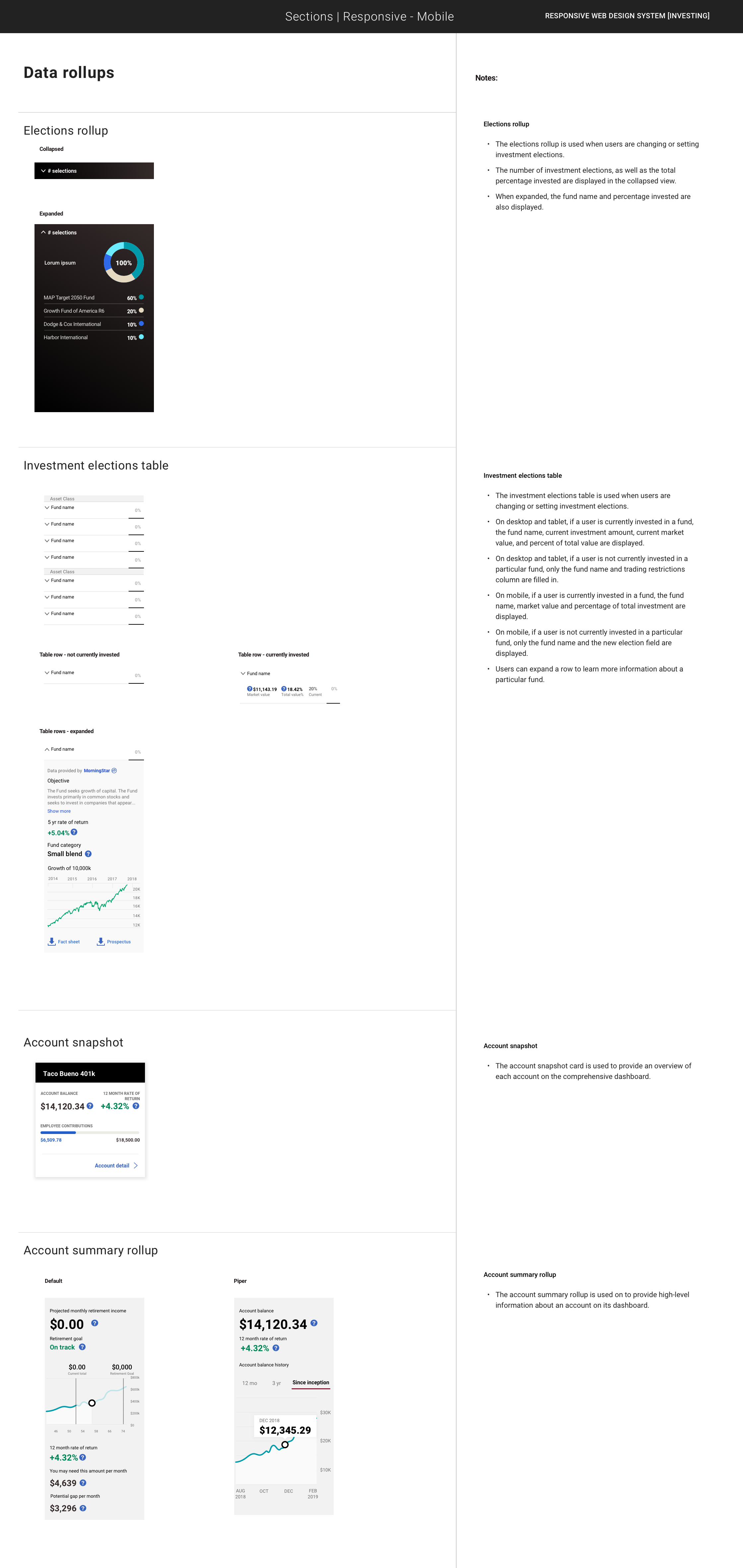
This design system was created for a large, regional financial institution. There were several lines of business – each with their own idiosyncrasies and their own product teams. This system had to meet the needs of every group while still being part of the parent brand.
Below are examples from that design system.


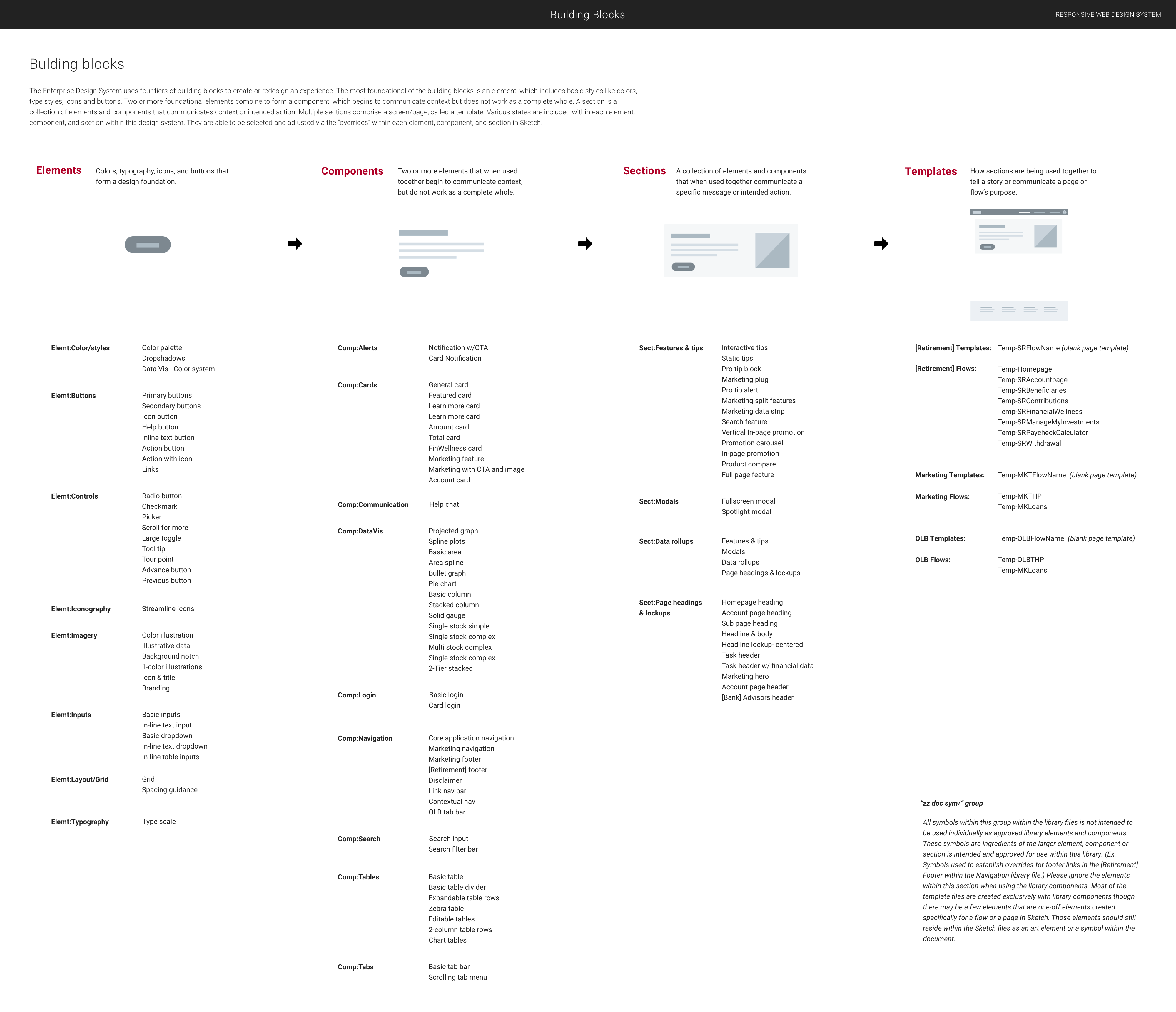
My Contributions
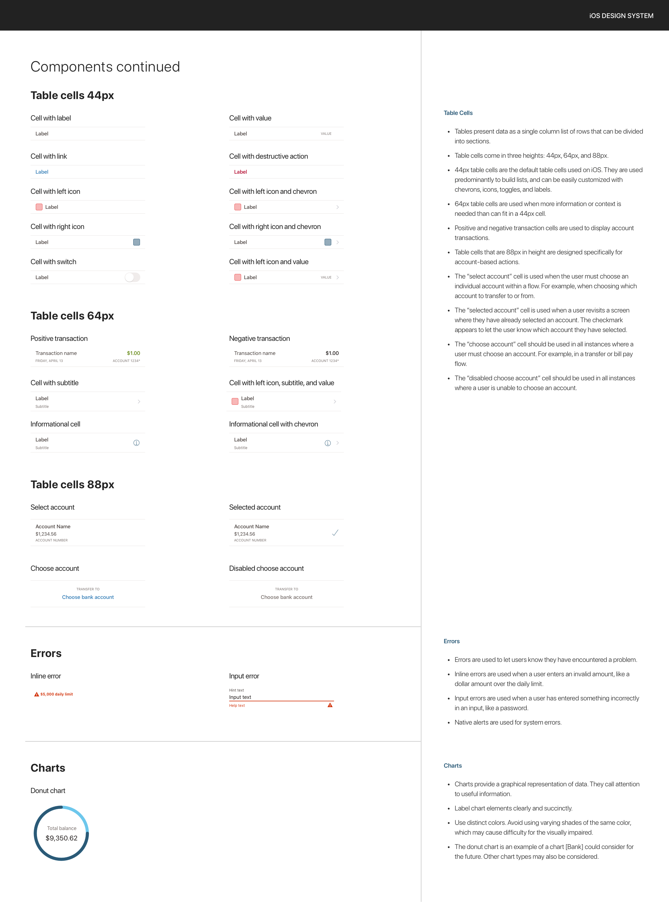
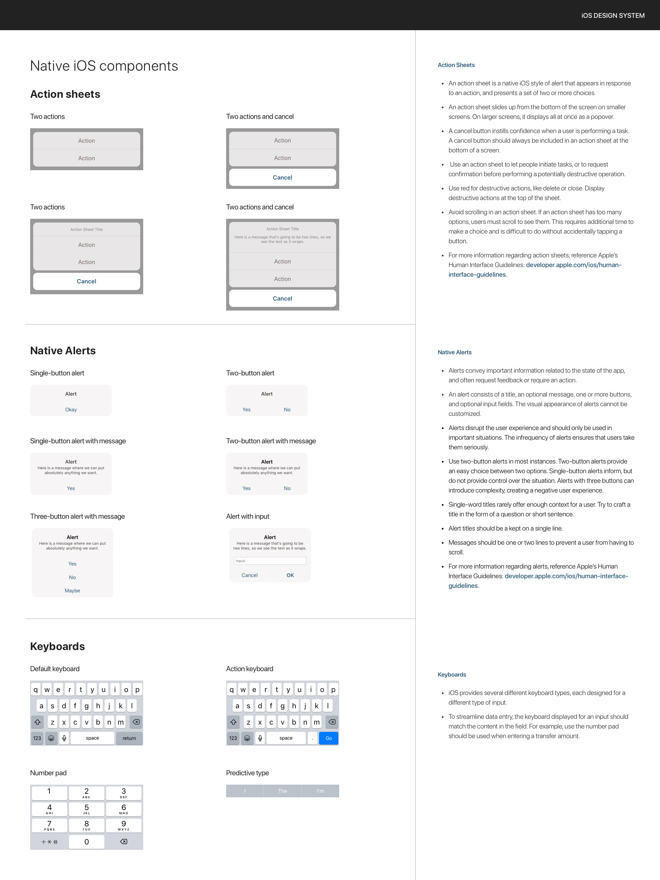
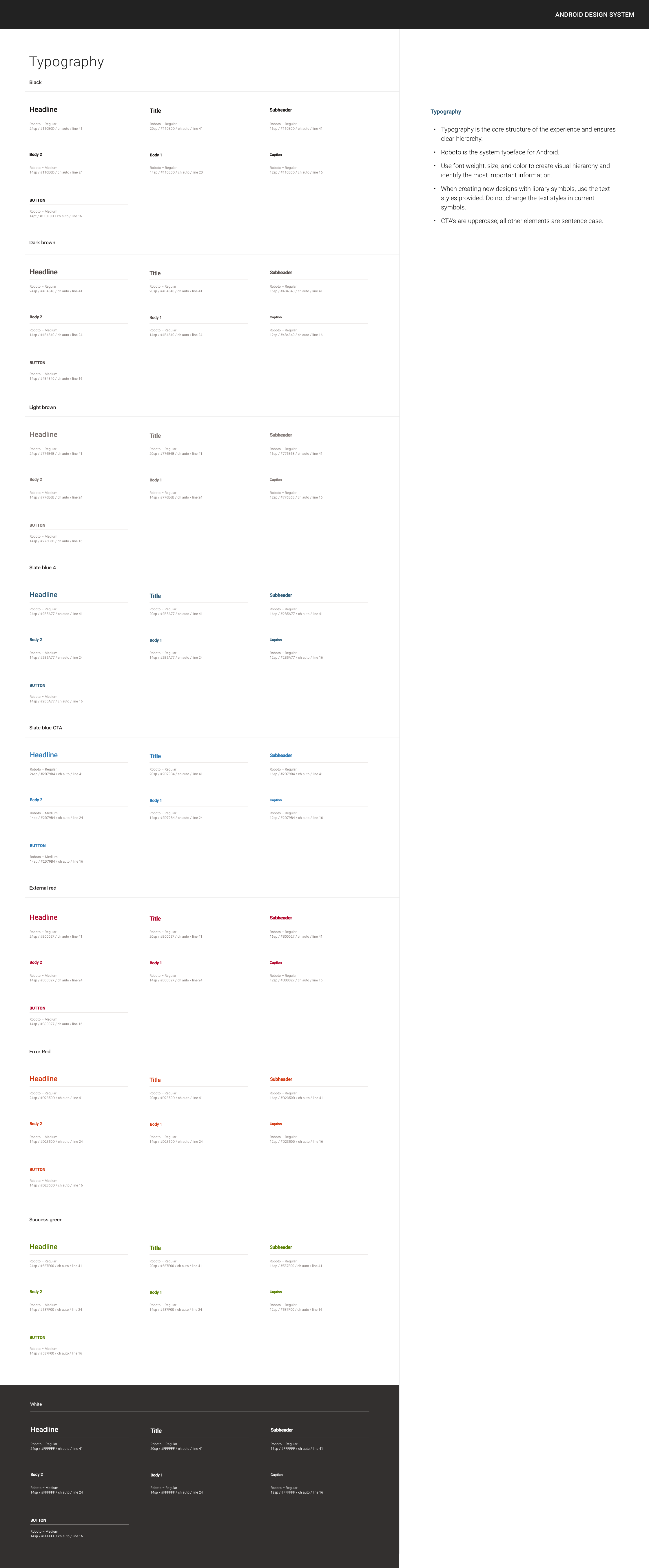
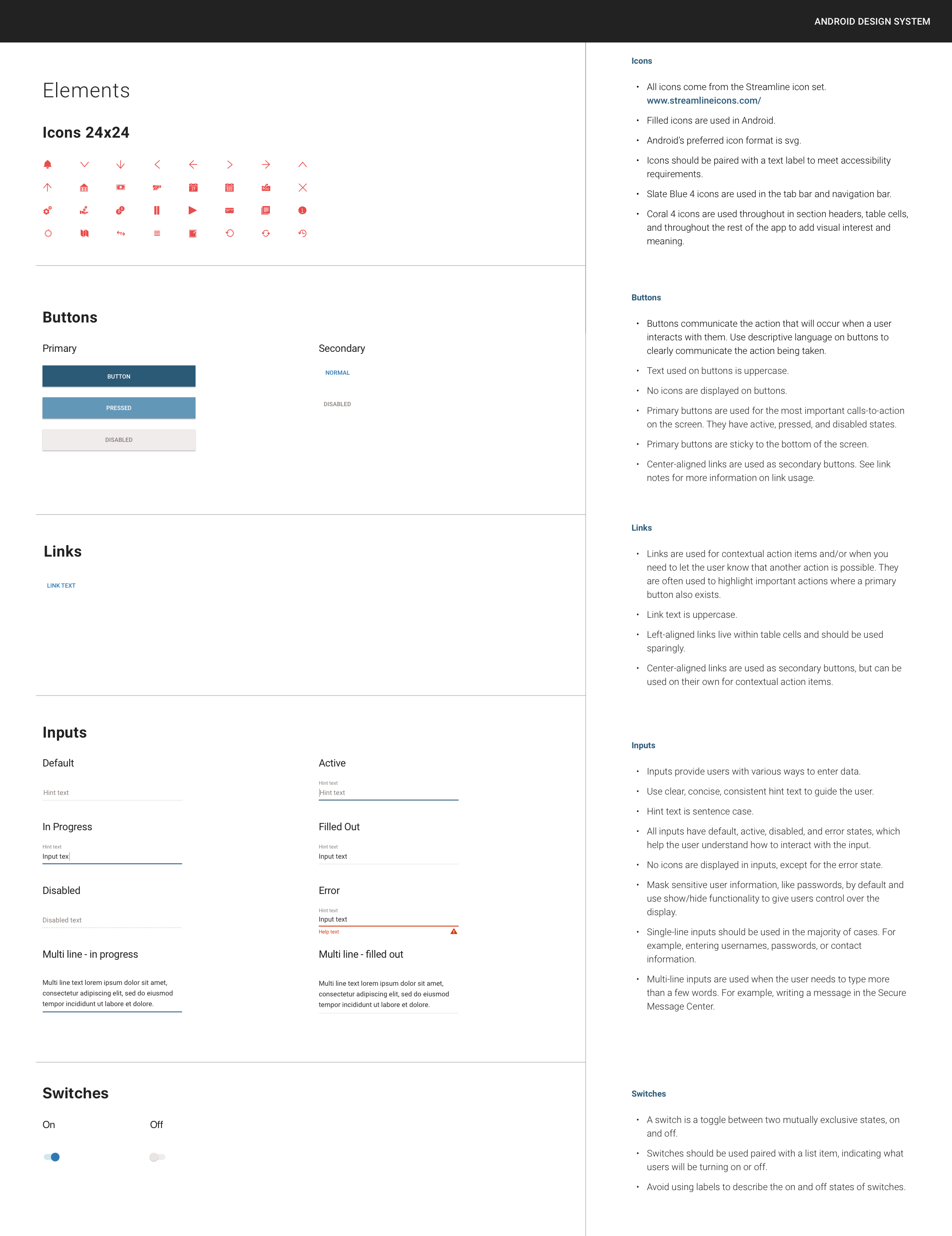
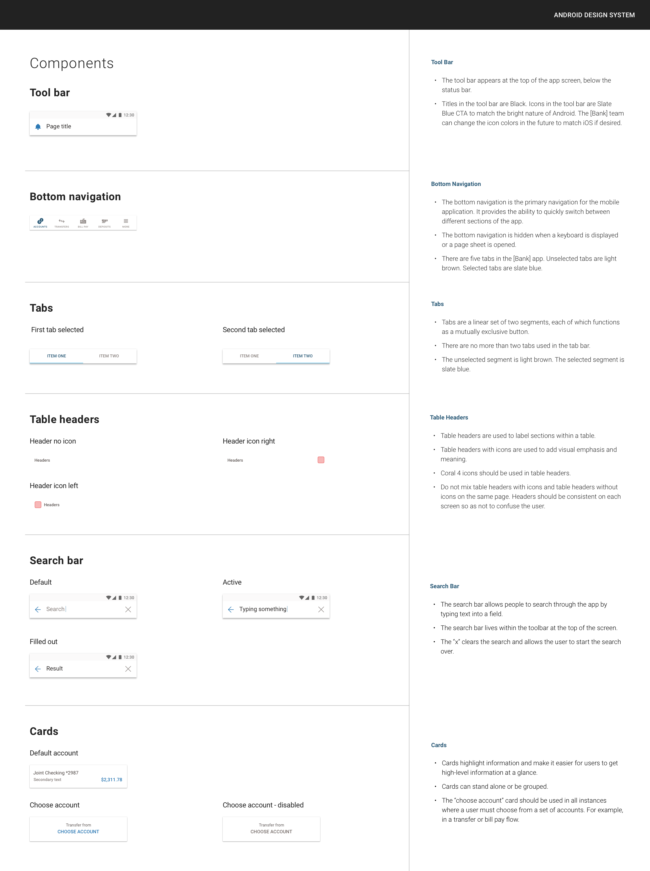
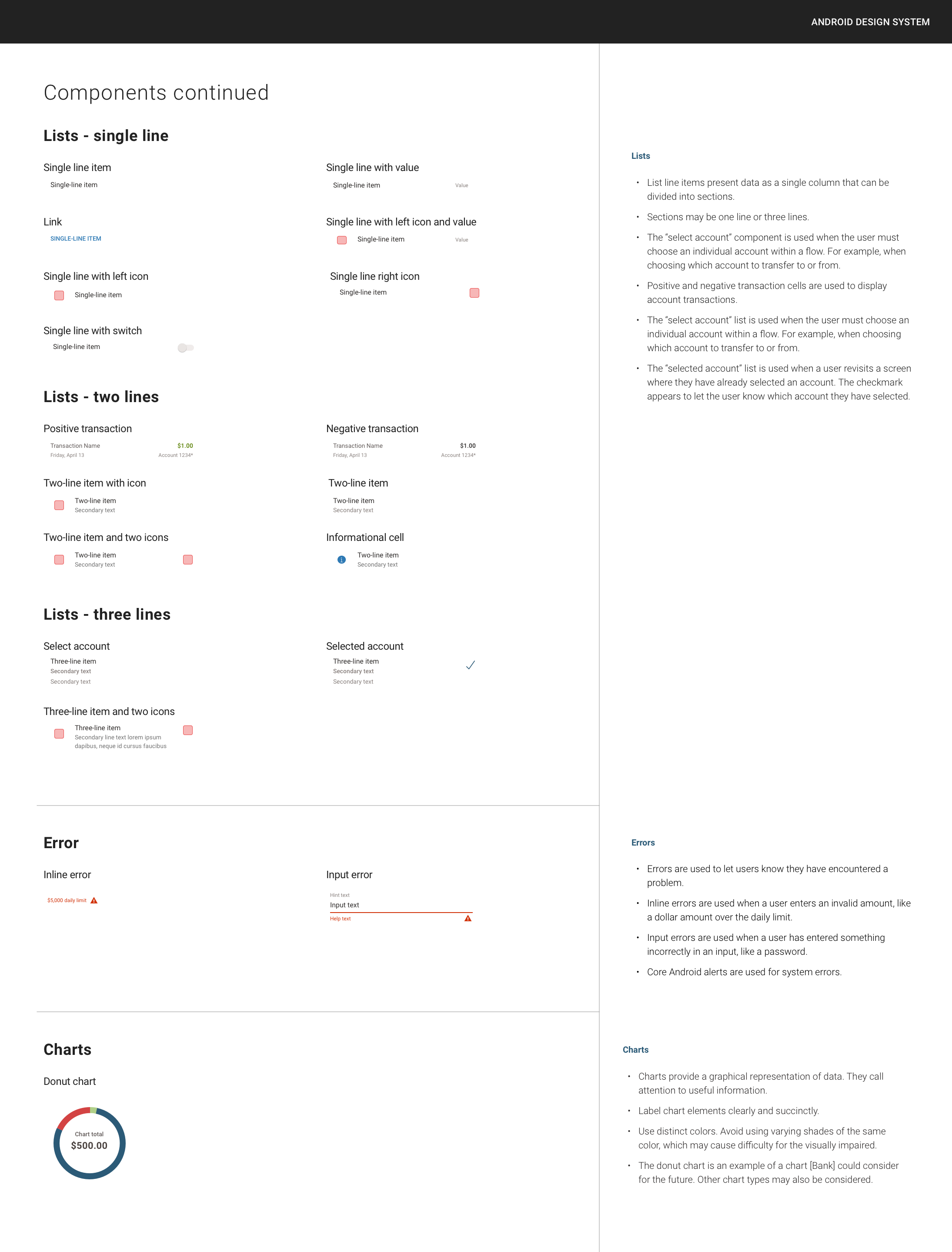
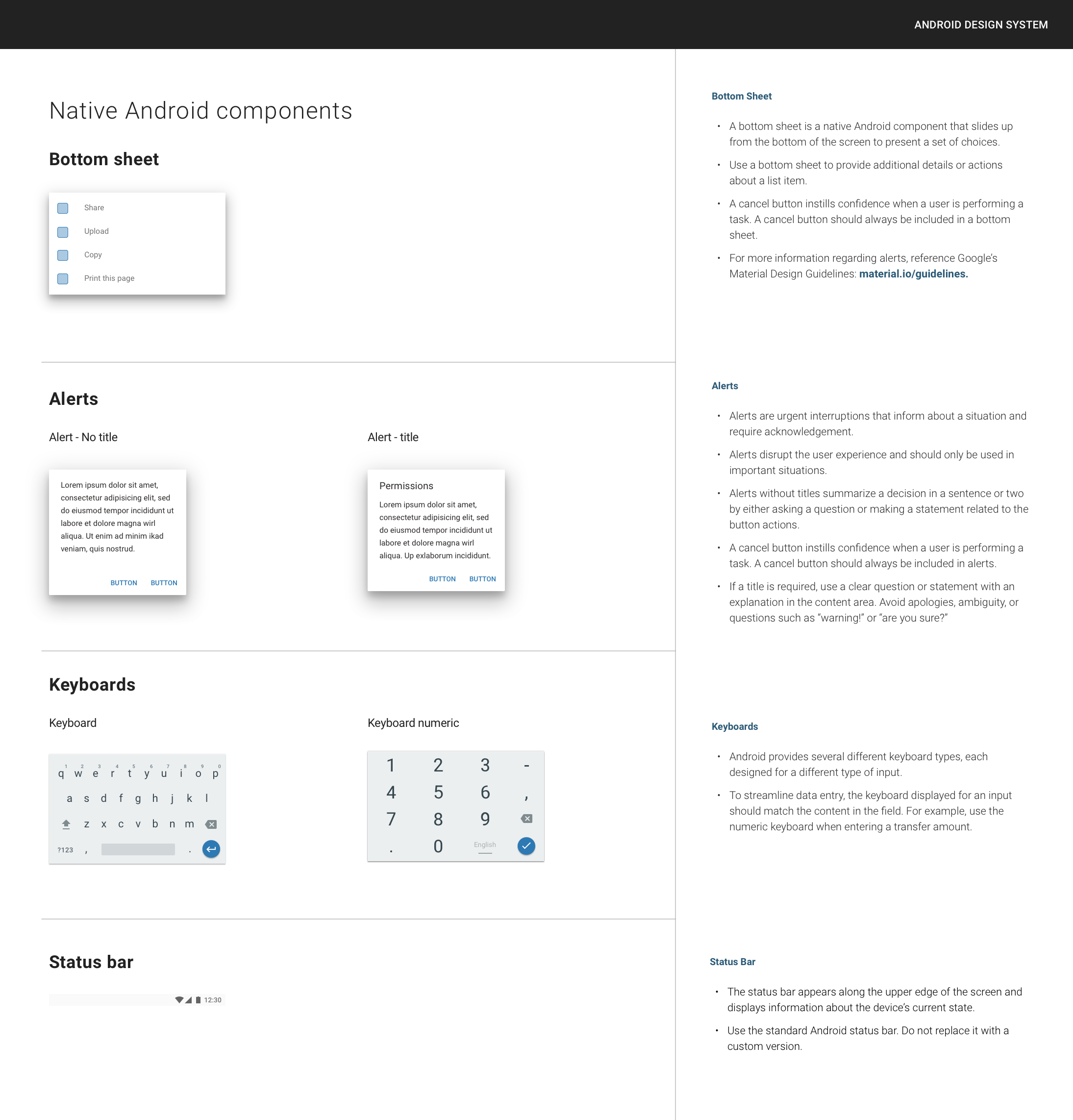
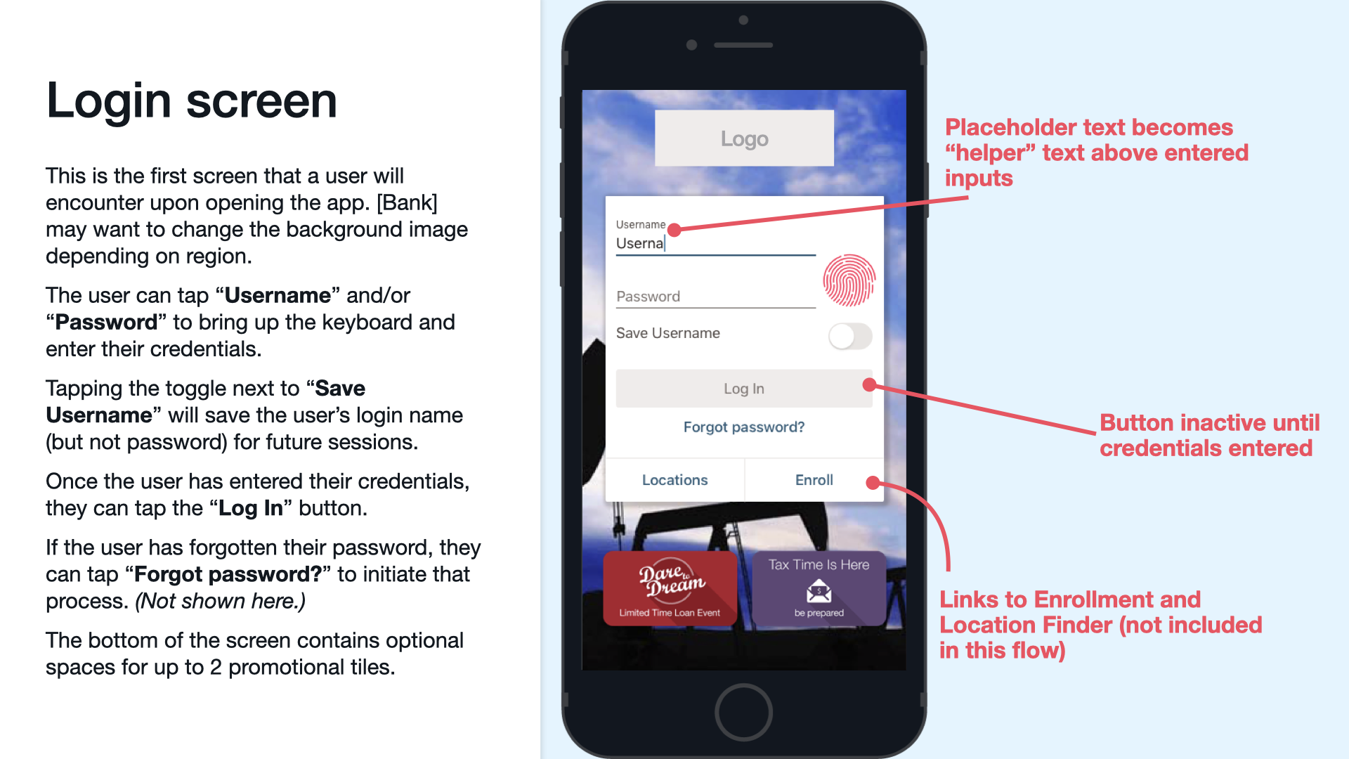
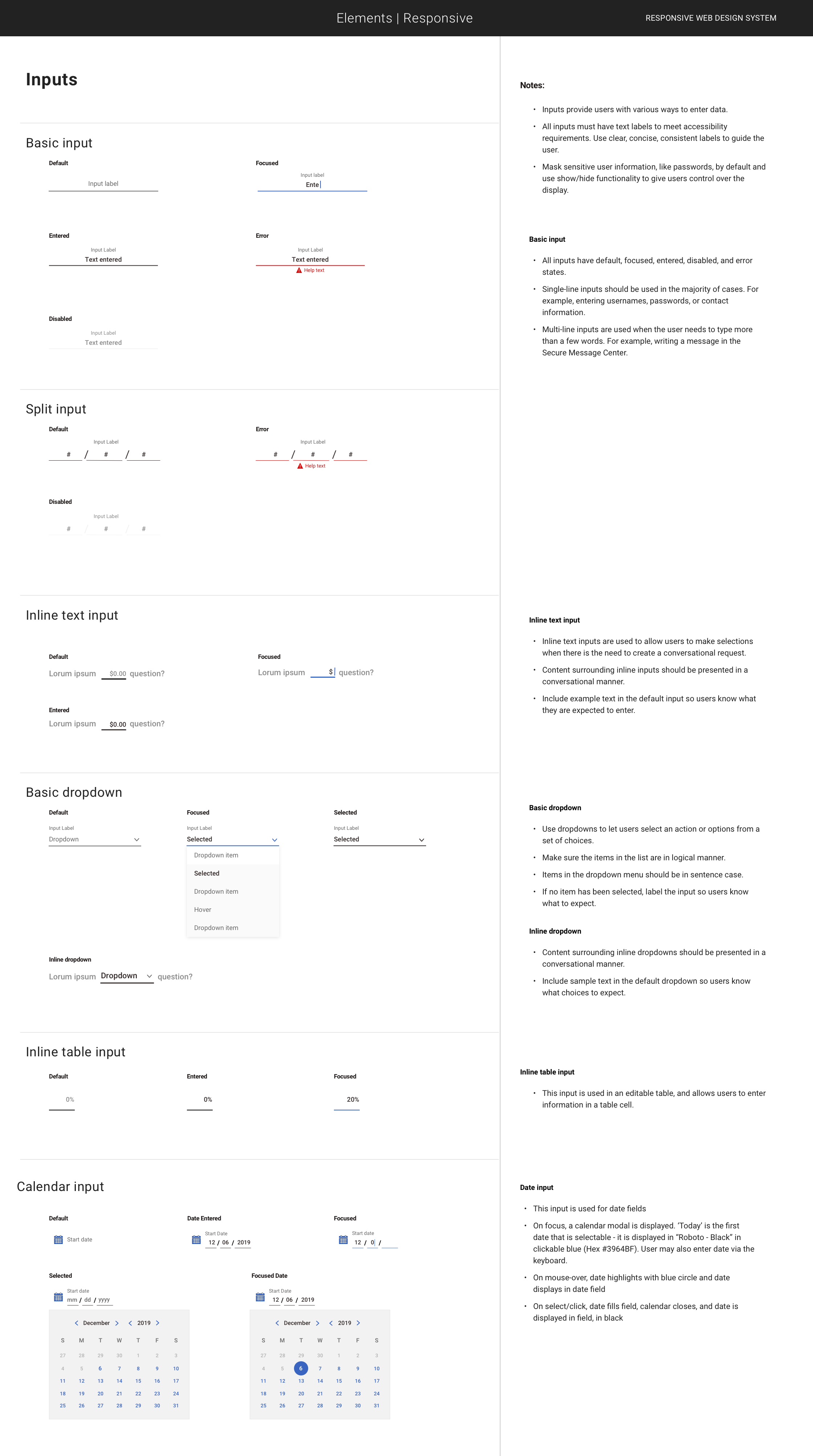
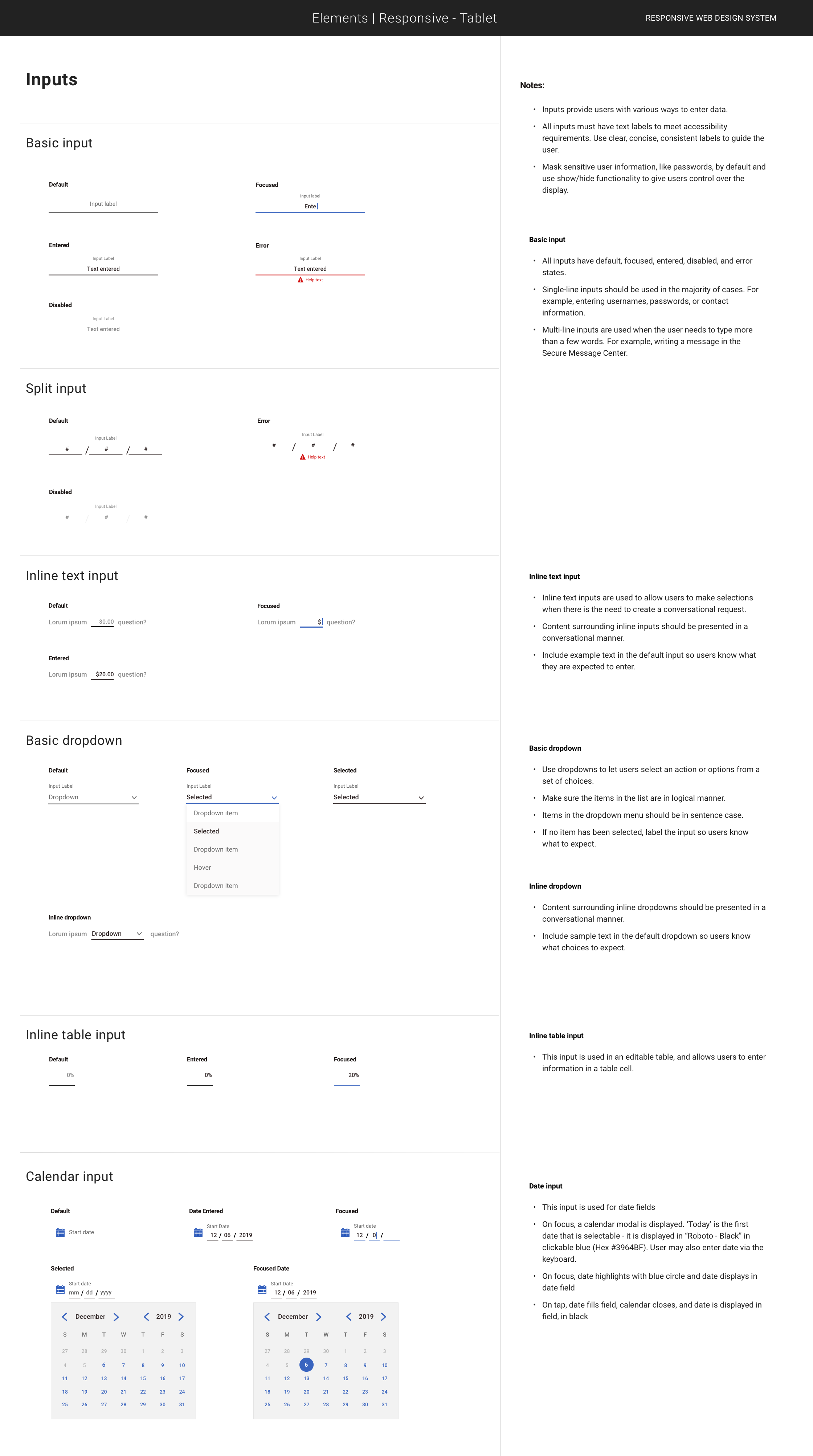
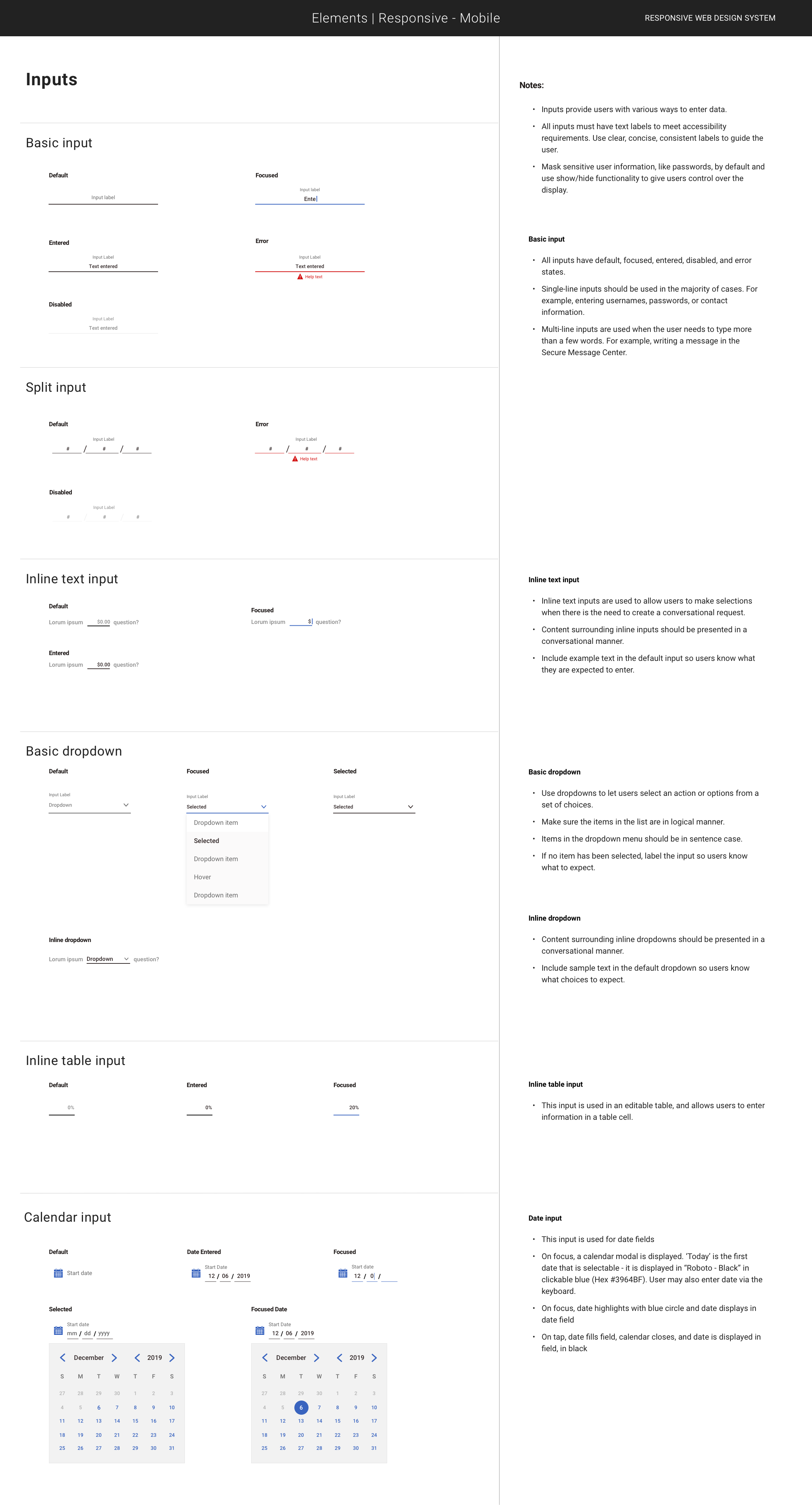
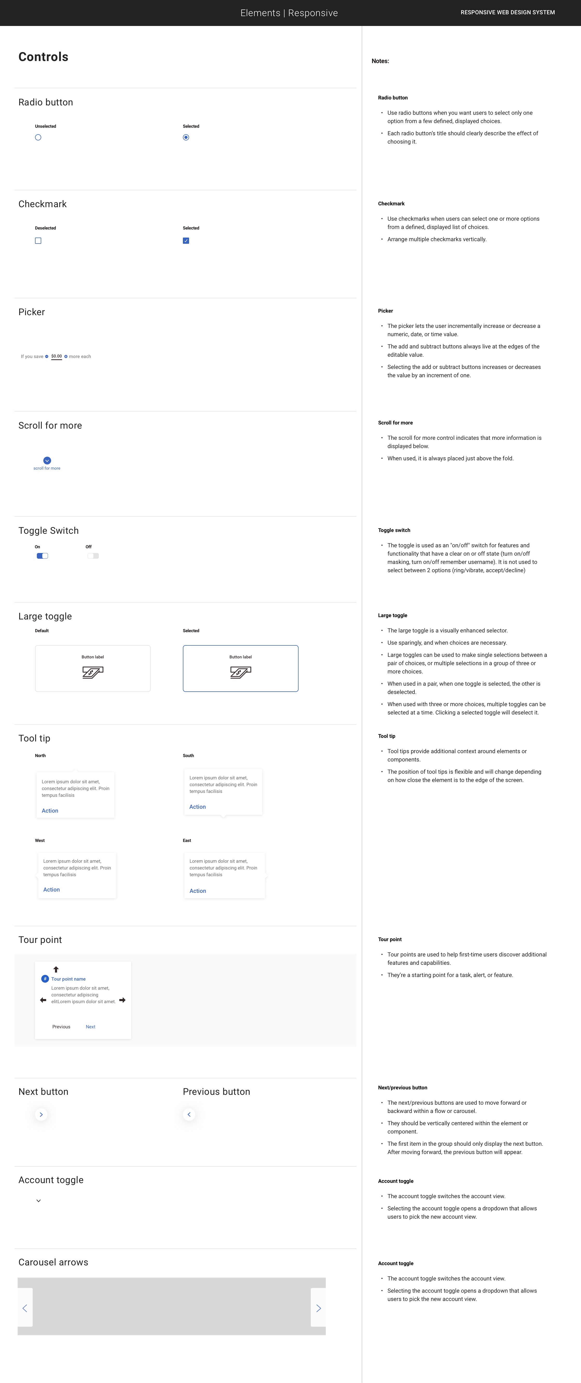
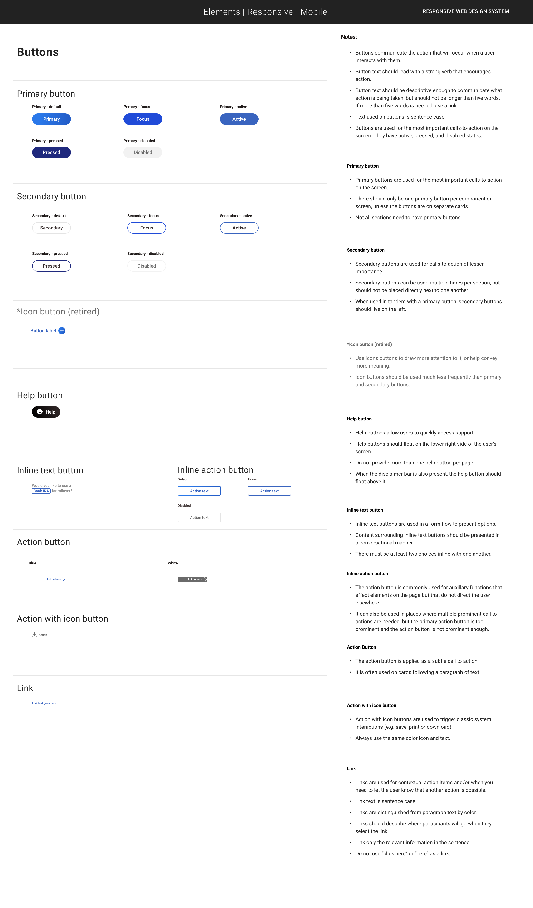
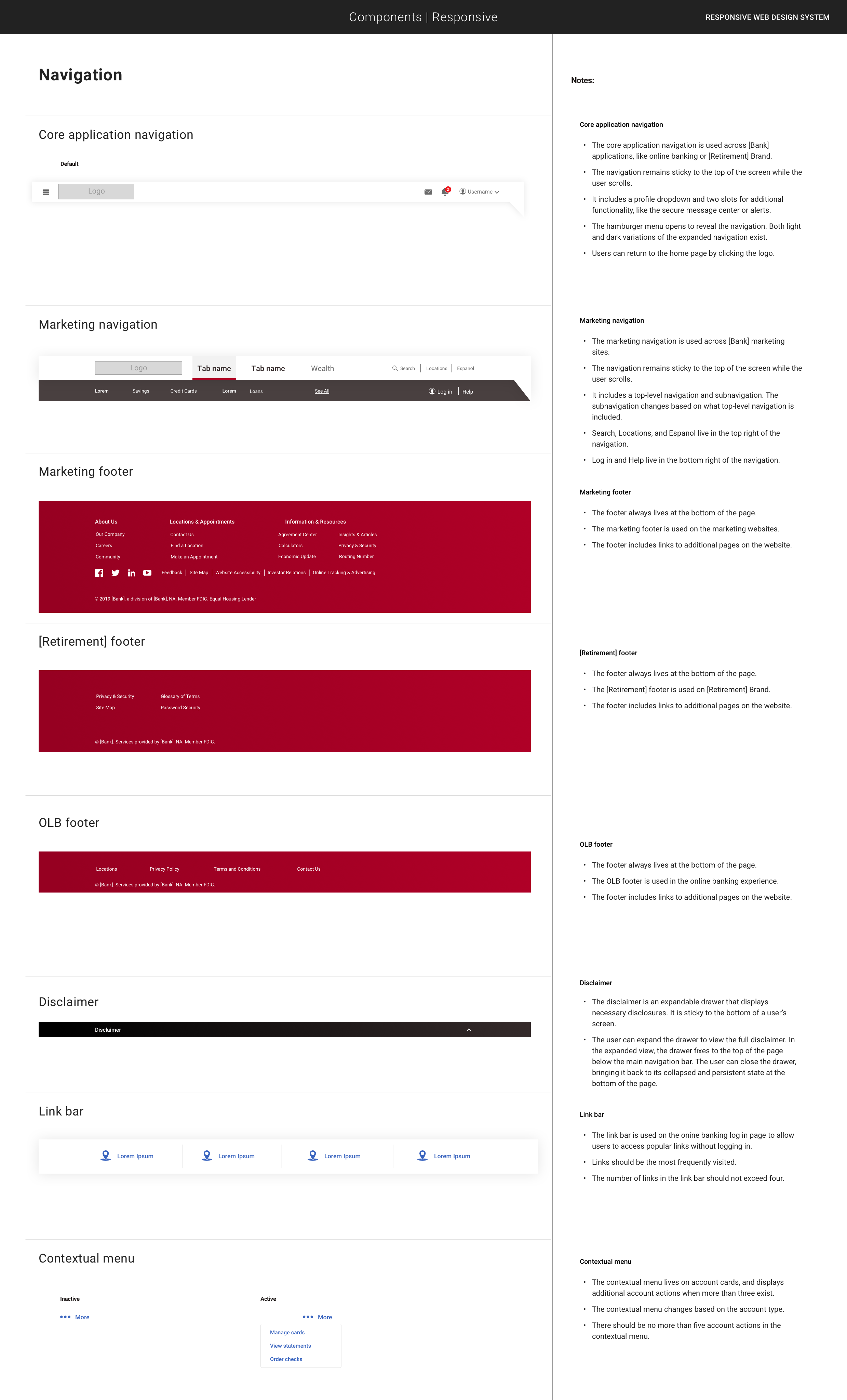
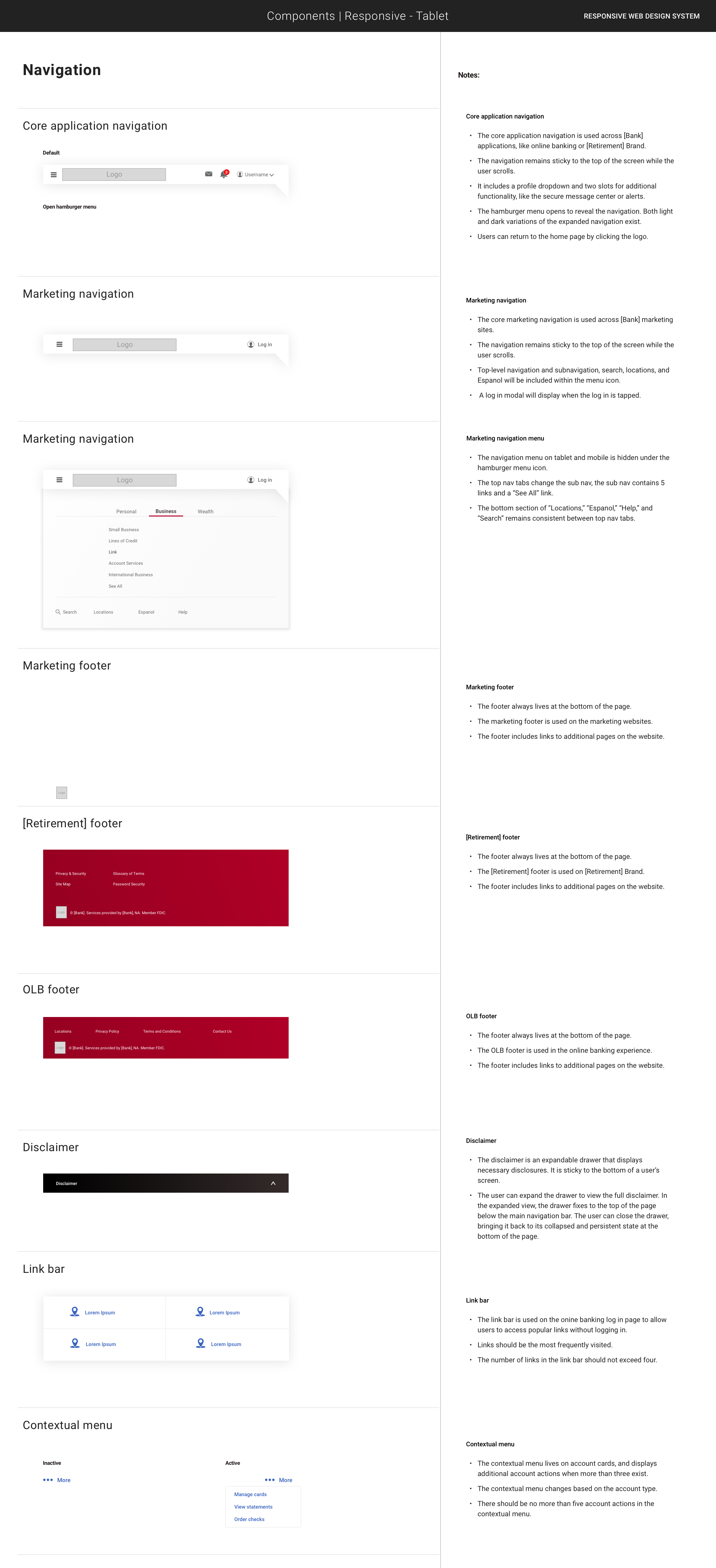
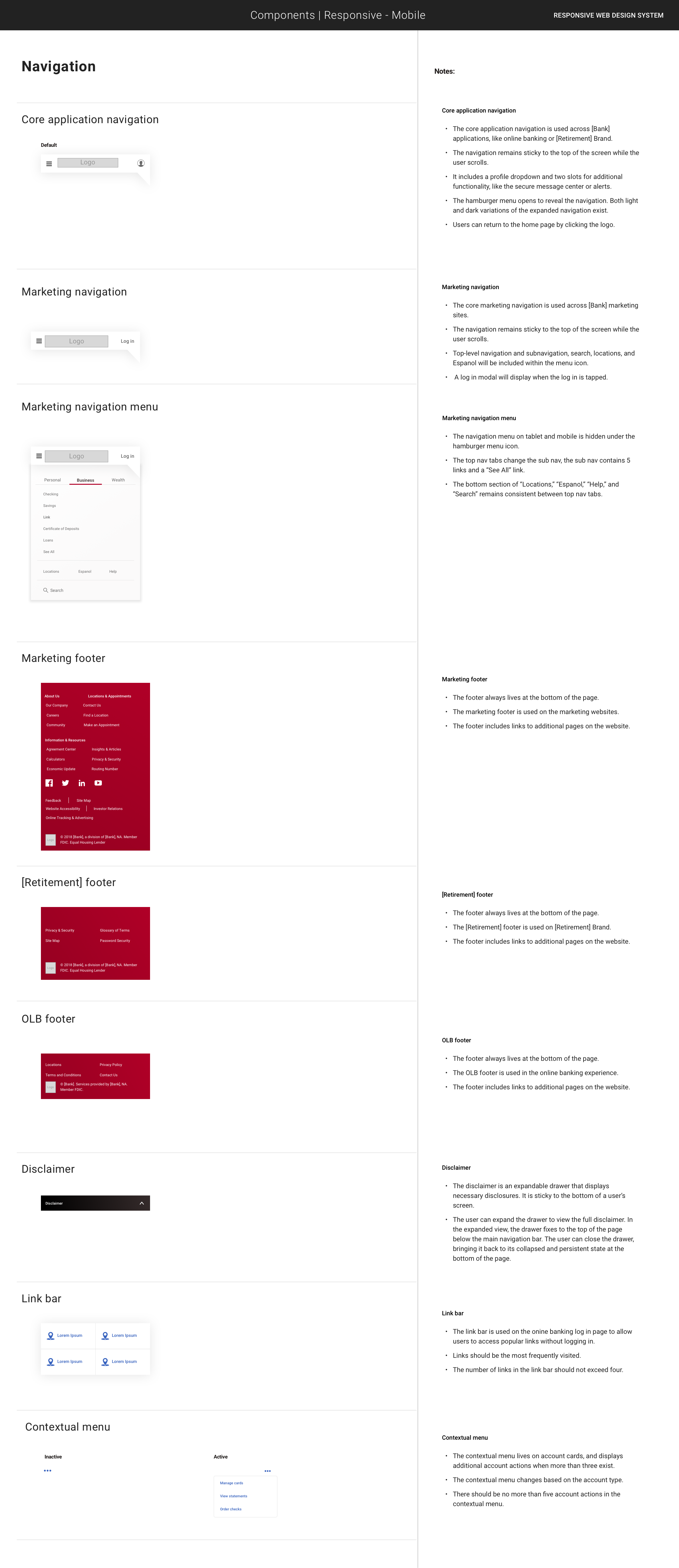
Co-led the system’s foundations and architecture with the UX team—establishing typography, color, spacing, grid, and semantic design tokens with an accessibility baseline (WCAG 2.0 AA) from day one.
Partnered with product teams across multiple lines of business to make the system themeable within the parent brand—accommodating LOB-specific needs (e.g., disclosures, rate tables, servicing tools) without forking the core.
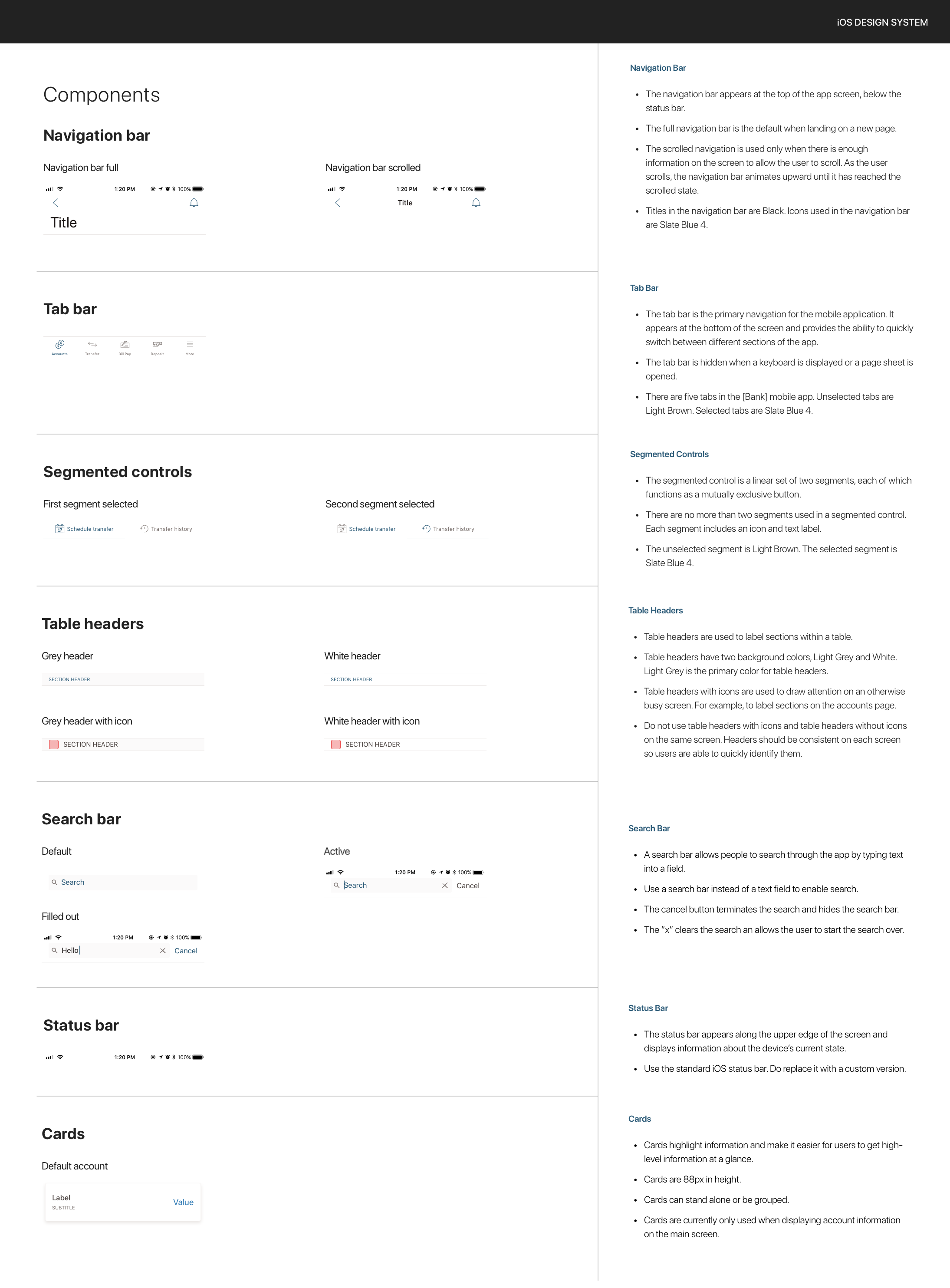
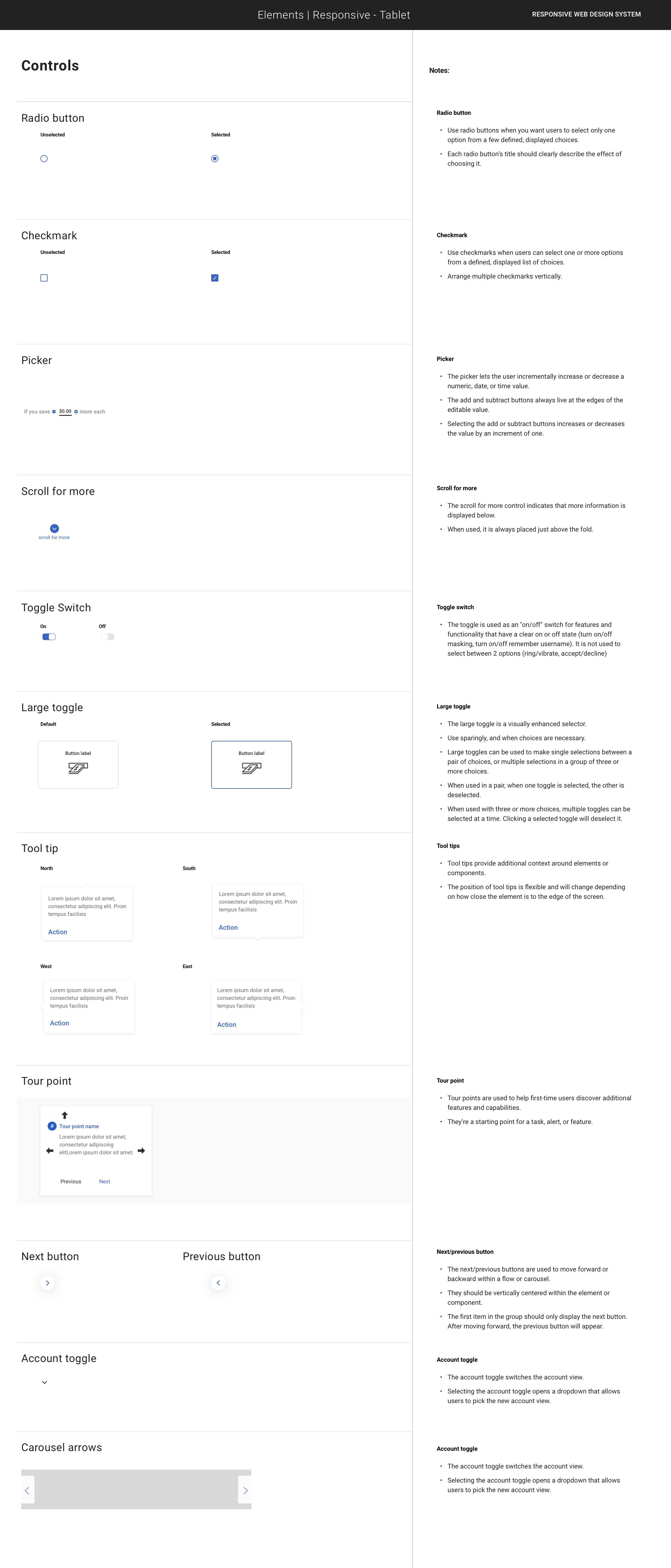
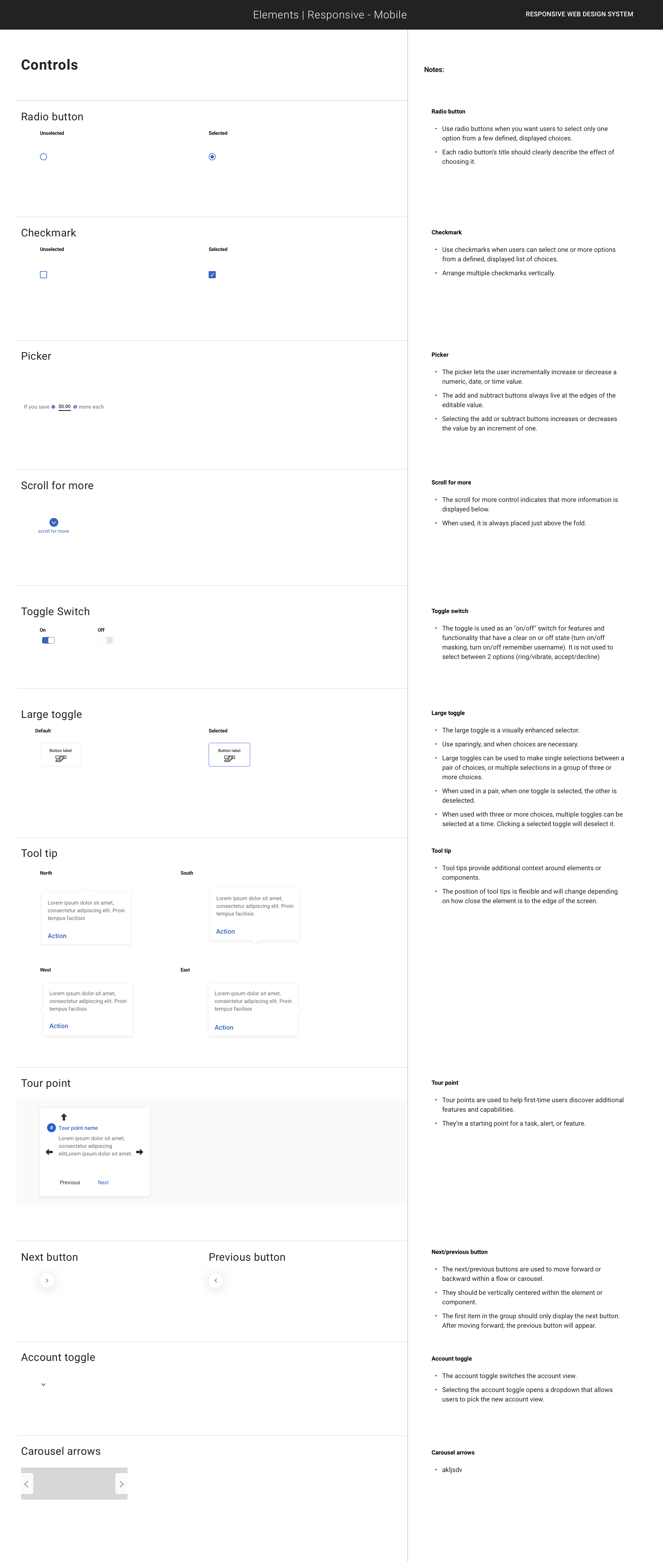
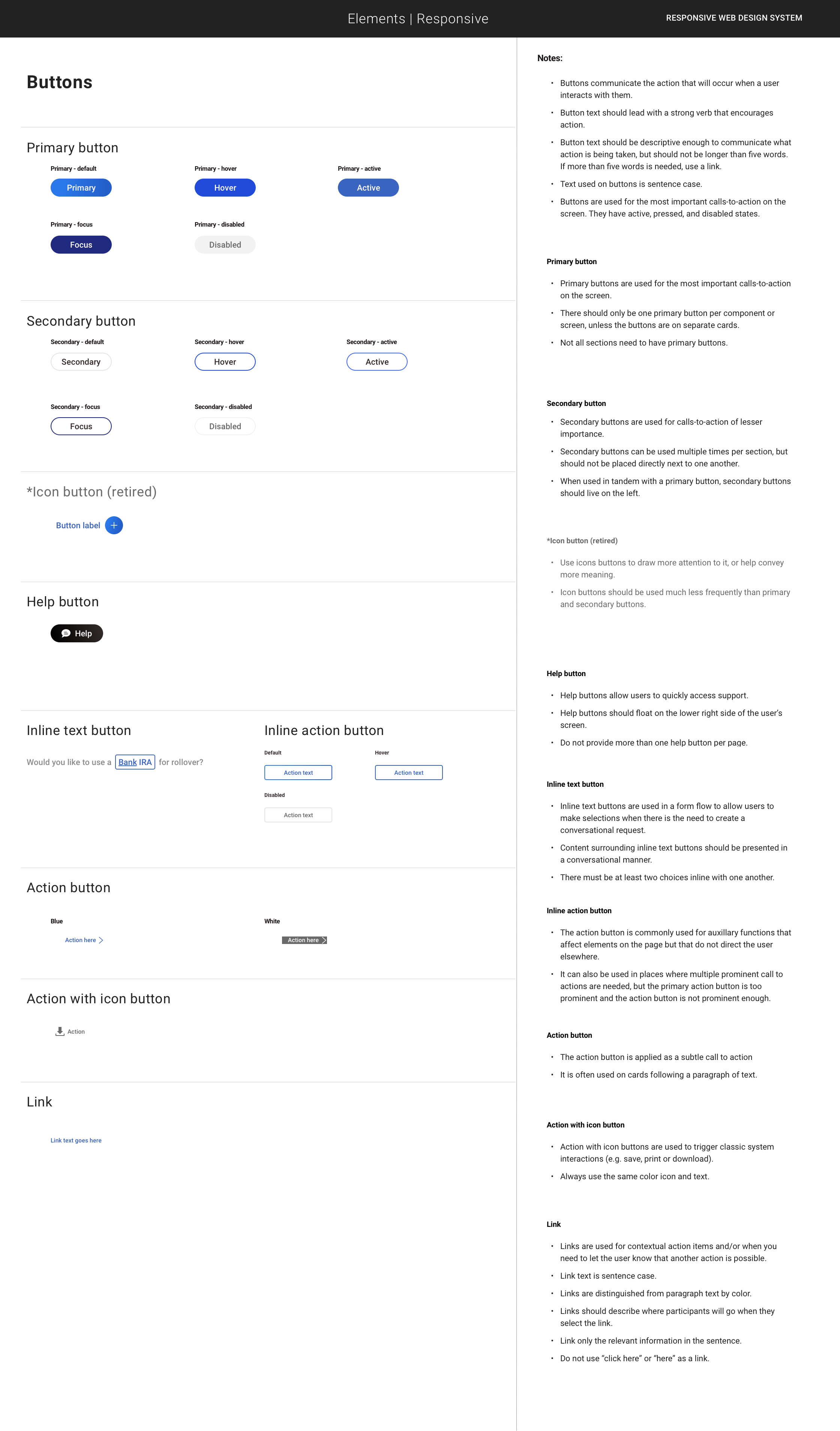
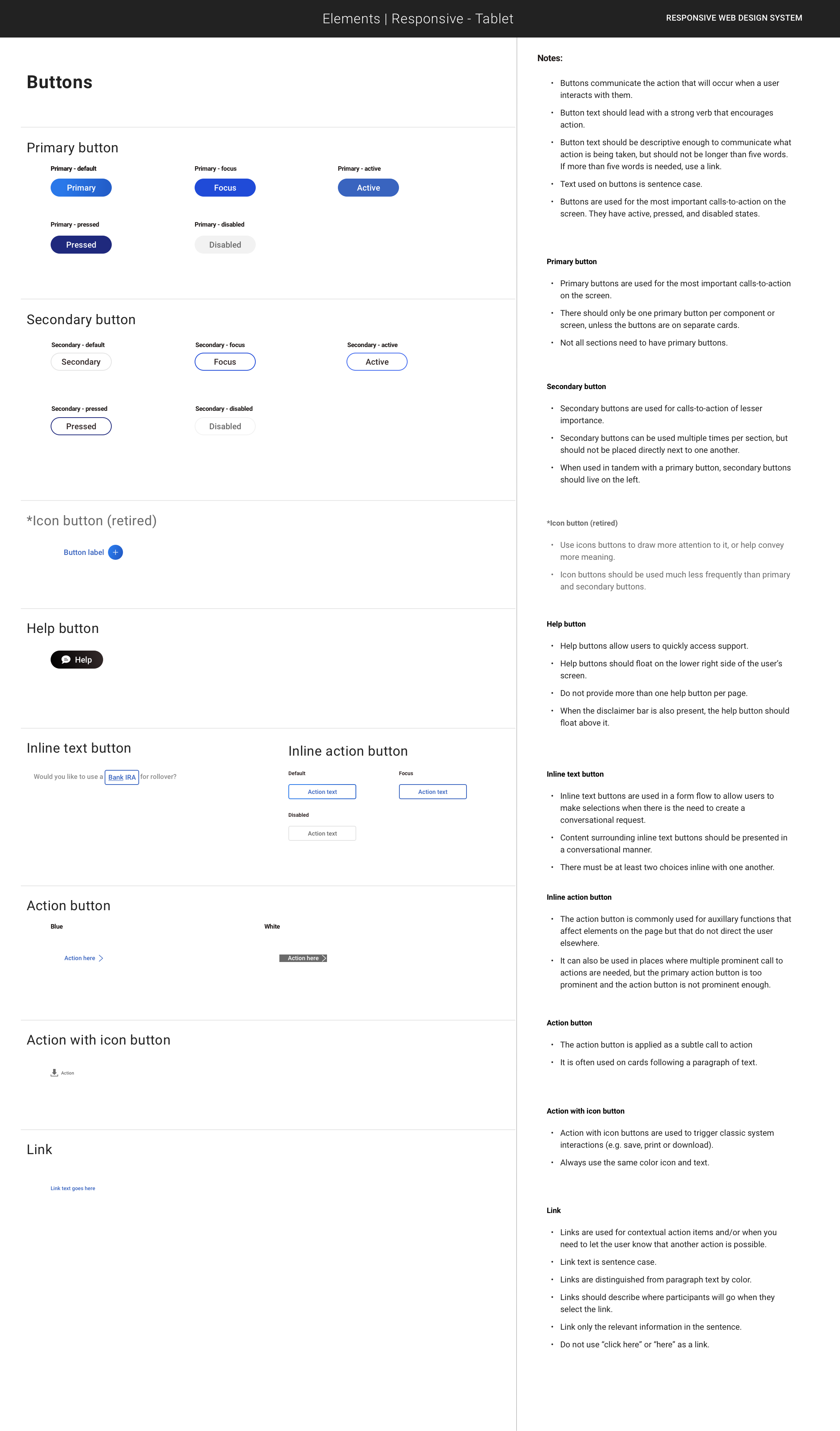
Co-built the Figma component library—codifying native and responsive components with states, variants, and usage rules—and worked with engineers to keep specs and code in sync.
Co-authored the playbooks and governance, including contribution workflow, naming conventions, content/microcopy guidance, versioning, and change logs; we ran office hours and reviews so the system became a shared source of truth.
Worked with Brand, Content, Risk/Compliance, QA, and Dev to embed compliant patterns (legal copy blocks, consent, error language) and ensure releases were review-ready.
Drove adoption and enablement with the broader org—starter templates, migration guides, and “refactor” examples—which reduced net-new UI requests and sped delivery across teams.